Hello
Im a newbie at this site, so hope I'm in the right place with this post.
I'm a bit of a novice at dioramas. I'm a big fan of them, as they are a great way to display models, and put them into a context. Figures also add a lot to models and dioramas, and I find painting them quite diffcult too.
Having found this site, and campaign (lets get small) seems an excellent way to get me moving on both a detailed diorama and some figures
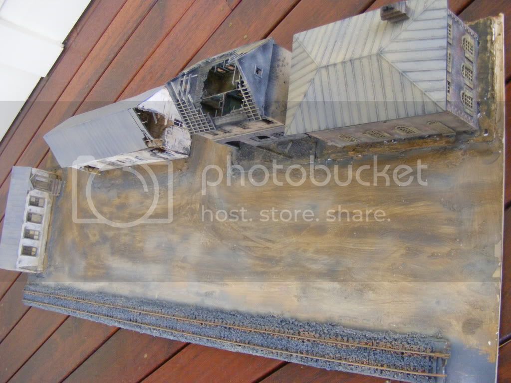
I've had a started diorama base sitting around for a couple of years. Its a piece of MDF about a yard long and a bit over a foot wide (90 cm x 34 cm).
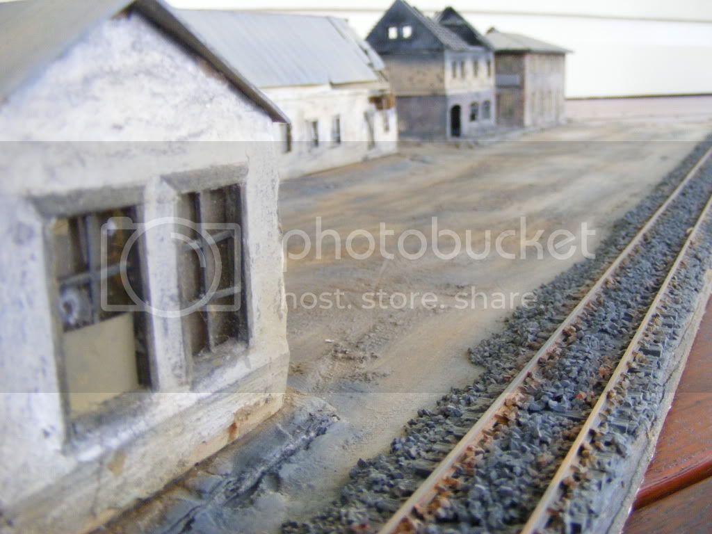
I had a piece of rail track attached and 4 buildings only one of which was permanently attached.
I've been using this mainly as something to place models on, to take pictures.
Anyway the task now is to make it into a full permanent diorama.
The aim of this diorama is to represent a battalion HQ area, behind the frontline, but within easy supply & communication distance of the front, somewhere on the eastern front, late in the war, (and not in winter months)
Though the damage to some buildings is not new, it indicates that the war is not far away, the area is in a temporarily stabilised sector of the front. As well as Battalion HQ, a main dressing station is also located here, and some of the buildings are used by the Quartermaster's platoon to store and distribute supplies for the Infantry Companies in the forward areas.
The rail line is a narrow gauge branch line, in peace time used for local light mining and forestry industries, and for a tram service, but is now in use by the military, to keep local battalions and other units along its length supplied with food, ammunition, spares and equipment , and also allows for the entrainment of stabilised sick and wounded who are railed to a major rail depot where they can then be transferred to a larger hospital, or who are then moved to another train to be shipped further to the rear for more treatment or convalescence. The rail line also delivers men returning from leave and convalsecence, and new personnel reinforcements to the battalion.
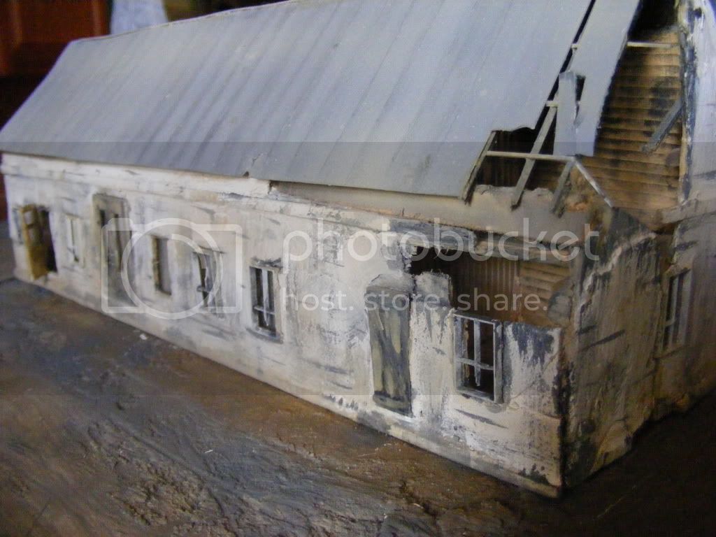
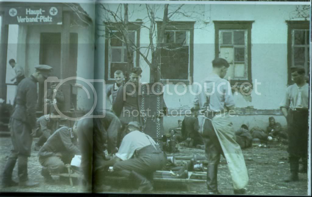
The buildings. The two whitewashed buildings are scratch built from balsa and plastic card. The one at the far end is based on a photo in the book 'The Onslaught' by Heinrich Graf von Einseidel, plate 91, which shows a similar looking building in use as a dressing station. The other is based on similar looking buildings in eastern europe. The other two buildings on the right are plastic kits, which I hope look about right for the era.
I have work to do on the buildings, and base, and of course any number of vehicles and personnel to populate the scene with , as well as the usual man made and natural objects to add. I'll use some already made models, and make some new ones specifically for the scene (such as a Phanomen Grantit ambulance).
All hints, tips, feedback suggestions and criticism is welcome.
I'll post updates and pics of the diorama as they occur
cheers
Neil
Hosted by Darren Baker
1/72nd scale diorama underway
Korpse
Queensland, Australia
Joined: October 06, 2009
KitMaker: 382 posts
Armorama: 378 posts
Joined: October 06, 2009
KitMaker: 382 posts
Armorama: 378 posts
Posted: Monday, October 12, 2009 - 04:18 PM UTC
exer
Dublin, Ireland
Joined: November 27, 2004
KitMaker: 6,048 posts
Armorama: 4,619 posts
Joined: November 27, 2004
KitMaker: 6,048 posts
Armorama: 4,619 posts
Posted: Monday, October 12, 2009 - 10:39 PM UTC
Hi Neil, nice work so far but that's an awfully big space to fill. The composition as you have it now is very square with the rail along one edge and the buildings at right angles or parrallel to it.
My suggestion would be to lay the rail at an angle
then you can have vehicles on both sides or even crossing the track.
My suggestion would be to lay the rail at an angle
then you can have vehicles on both sides or even crossing the track.
slodder
North Carolina, United States
Joined: February 22, 2002
KitMaker: 11,718 posts
Armorama: 7,138 posts
Joined: February 22, 2002
KitMaker: 11,718 posts
Armorama: 7,138 posts
Posted: Tuesday, October 13, 2009 - 12:32 AM UTC
Great buildings, watch thier seam lines at ground level.
I have to agree with Pat, the angle is better in composition. However, I know it may be too late to move the tracks. What you may be able to do is fill the space with some ramp link 'docks' that act as loading docks, maybe a temporary crane, and lots and lots of 'stuff'.
Gorizont
Sachsen, Germany
Joined: November 28, 2007
KitMaker: 1,462 posts
Armorama: 1,289 posts
Joined: November 28, 2007
KitMaker: 1,462 posts
Armorama: 1,289 posts
Posted: Tuesday, October 13, 2009 - 07:26 AM UTC
Yes the diagonally positioned track would look better and doesnīt have a "static" look.
Perhaps you can change this.
Thatīs an interesting story for the dio!
greetings...
Soeren
Perhaps you can change this.
Thatīs an interesting story for the dio!
greetings...
Soeren
AJLaFleche
Massachusetts, United States
Joined: May 05, 2002
KitMaker: 8,074 posts
Armorama: 3,293 posts
Joined: May 05, 2002
KitMaker: 8,074 posts
Armorama: 3,293 posts
Posted: Tuesday, October 13, 2009 - 08:50 AM UTC
While diagonal lines are generally better liked by diorama builders, there is nothing inherently wrong with symmetry in a scene. Consider the style of Stanley Kubrick. In many of his movie set pieces, everything is perfectly square to the camera as well as having the subject in the dead center of the screen.
And Leonardo da Vinci broke this rule in one of his most famous paintings:
Tordenskiold
Aarhus, Denmark
Joined: February 12, 2005
KitMaker: 426 posts
Armorama: 293 posts
Joined: February 12, 2005
KitMaker: 426 posts
Armorama: 293 posts
Posted: Tuesday, October 13, 2009 - 09:14 AM UTC
Quoted Text
Hi Neil, nice work so far but that's an awfully big space to fill. The composition as you have it now is very square with the rail along one edge and the buildings at right angles or parrallel to it.
My suggestion would be to lay the rail at an angle
then you can have vehicles on both sides or even crossing the track.
This looks totally wrong to me
If you continue the line of the railway, it will hit the houses just outside the plate, it is even too close to the house on the edge to be realistic.
The square look - in this case - is much better IMHO.
exer
Dublin, Ireland
Joined: November 27, 2004
KitMaker: 6,048 posts
Armorama: 4,619 posts
Joined: November 27, 2004
KitMaker: 6,048 posts
Armorama: 4,619 posts
Posted: Tuesday, October 13, 2009 - 10:09 AM UTC
Quoted Text
This looks totally wrong to me
If you continue the line of the railway, it will hit the houses just outside the plate, it is even too close to the house on the edge to be realistic.
The square look - in this case - is much better IMHO.
Well Jan Maybe the line of houses doesn't continue outside the plate Trains do run quite close to buildings, -sometimes surprisingly close and the rail as it is is closer to the building on the left of the base than it it is to the large building in my suggested layout .
Besides it was a quick example based on two minutes of photoshop I didn't mean that he should copy it exactly just as an example of how a diagonal line can cut up a big space and Neil did ask for suggestions.
Korpse
Queensland, Australia
Joined: October 06, 2009
KitMaker: 382 posts
Armorama: 378 posts
Joined: October 06, 2009
KitMaker: 382 posts
Armorama: 378 posts
Posted: Tuesday, October 13, 2009 - 01:25 PM UTC
Hello again
thanks heaps to everyone who posted for the opinions and suggestions. I genuinely appreciate opinions and criticism, as it helps me see the things that I might be missing. I wasn't sure that I'd get any comments, and am pleased that you took time to give me your thoughts and views.
I've been a little concerned about how 'lineal' the buildings and track look on the diorama. I agree that to put things at an angle (along the lines of Pat's reworked picture) usually does look better.
One reason I didnt go for the angled track was the board is actually quite narrow at 34cm (or one foot, one and a half inches). I think I'd need a wider board, and then would need to look again at placement of buildings. A wider board becomes harder to work on and harder to find a spot for in my home. At present its bookshelf width (and length) which is very convenient for storage and placement.
Another factor I considered is that rail lines are very often laid parallel to existing roads and buildings (or buildings and roads are built parrallel to train lines). The white washed buildings are meant to be the older, which were possibly built before the train line was laid, hence one is quite close to the line. The line scales to just about narrow gauge, its a light industrial line, which existed to service local primary industries, not as a main train route between major cities.
The idea was to have a wide thoroughfare, with a fair bit of space between the buildings and the line, as this is not a city, its part of a small town in a rural area where more space exists, without sealed roads, or proper drainage. I'm thinking about putting a widely spaced row of medium trees in front of the three parallel buildings - to further add to that rural town look.
The wide open area in the middle was intentional, to allow placement of a number of vehicles, people and objects, without being too crowded, again influenced by many pictures of small dusty towns from the Ost Front. (This should also provide a number of differing angles to take pictures).
below is a scan of part of the building that I've based the building at the far end of the diorama on. I won't even try to replicate the positioning and stances of the people in the picture, but will use it as a general basis for a few figures. The photo is from The Onslaught, by Heinrich Graf Von Einsiedel, published by Sidgwick & Jackson 1984.
I'll post more pics when I get a bit more done.
Please don't let up with suggestions and criticism - if I post a picture of something that looks wrong, or could be improved, please let me know. I've been known to make some blazingly obvious errors with models, that I haven't seen till someone has pointed them out. I may not always be able to comply with every suggestion or criticism though, as I'm not a master modeller, and I need to get this finished in December
cheers
Neil
under construction (all 1/72nd);
Phanomen Granit Ambulance
late war wooden cab Opel Blitz Holzengas
Phanomen Kubelwagen
undergoing renewal, renovation & repainting;
wooden cab Opel Blitz
BA3 Armoured Car
thanks heaps to everyone who posted for the opinions and suggestions. I genuinely appreciate opinions and criticism, as it helps me see the things that I might be missing. I wasn't sure that I'd get any comments, and am pleased that you took time to give me your thoughts and views.
I've been a little concerned about how 'lineal' the buildings and track look on the diorama. I agree that to put things at an angle (along the lines of Pat's reworked picture) usually does look better.
One reason I didnt go for the angled track was the board is actually quite narrow at 34cm (or one foot, one and a half inches). I think I'd need a wider board, and then would need to look again at placement of buildings. A wider board becomes harder to work on and harder to find a spot for in my home. At present its bookshelf width (and length) which is very convenient for storage and placement.
Another factor I considered is that rail lines are very often laid parallel to existing roads and buildings (or buildings and roads are built parrallel to train lines). The white washed buildings are meant to be the older, which were possibly built before the train line was laid, hence one is quite close to the line. The line scales to just about narrow gauge, its a light industrial line, which existed to service local primary industries, not as a main train route between major cities.
The idea was to have a wide thoroughfare, with a fair bit of space between the buildings and the line, as this is not a city, its part of a small town in a rural area where more space exists, without sealed roads, or proper drainage. I'm thinking about putting a widely spaced row of medium trees in front of the three parallel buildings - to further add to that rural town look.
The wide open area in the middle was intentional, to allow placement of a number of vehicles, people and objects, without being too crowded, again influenced by many pictures of small dusty towns from the Ost Front. (This should also provide a number of differing angles to take pictures).
below is a scan of part of the building that I've based the building at the far end of the diorama on. I won't even try to replicate the positioning and stances of the people in the picture, but will use it as a general basis for a few figures. The photo is from The Onslaught, by Heinrich Graf Von Einsiedel, published by Sidgwick & Jackson 1984.
I'll post more pics when I get a bit more done.
Please don't let up with suggestions and criticism - if I post a picture of something that looks wrong, or could be improved, please let me know. I've been known to make some blazingly obvious errors with models, that I haven't seen till someone has pointed them out. I may not always be able to comply with every suggestion or criticism though, as I'm not a master modeller, and I need to get this finished in December
cheers
Neil
under construction (all 1/72nd);
Phanomen Granit Ambulance
late war wooden cab Opel Blitz Holzengas
Phanomen Kubelwagen
undergoing renewal, renovation & repainting;
wooden cab Opel Blitz
BA3 Armoured Car
Korpse
Queensland, Australia
Joined: October 06, 2009
KitMaker: 382 posts
Armorama: 378 posts
Joined: October 06, 2009
KitMaker: 382 posts
Armorama: 378 posts
Posted: Wednesday, October 14, 2009 - 12:58 AM UTC
Hello
have progressed a little further
have attempted to seal the 'seam' where the buildings meet the ground, though the pics show I've still got a gap or two to fill.
I've also added more ballast to the rail line, but this time with finer grade, as the other stuff was a bit over scale I think
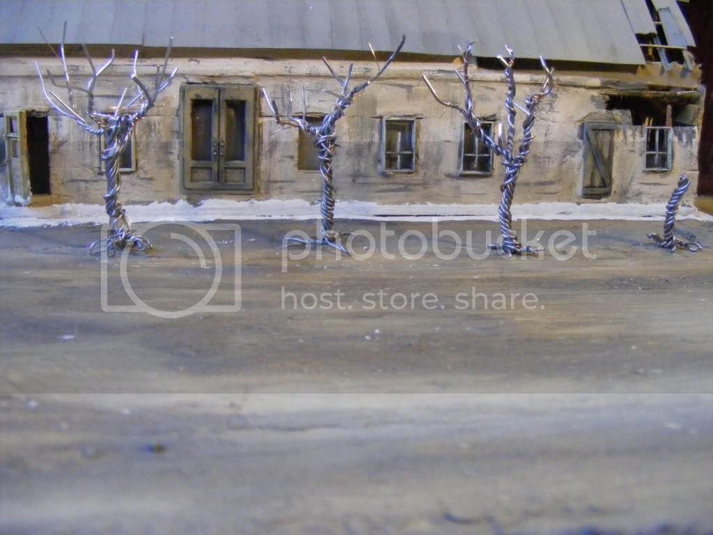
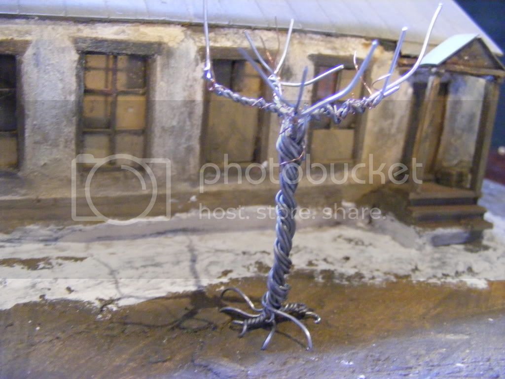
And I have started some "wire trees" (using the helpful feature elsewhere on this site). These are a first attempt, so need more work yet, just getting a feel for size and placement. I might leave them bare, or maybe some autumnal colours might suit the other tones existing in the diorama
Depending on how they turn out, I'll keep them, or go hunting for some natural looking twigs, or maybe buy some commercial trees.
I think the trees help the scene look more 'small town' or rural - at least thats what I'm aiming for. They are to be evenly spaced and "frame" the building entrances
I wasn't going to put any trees in front of the 'newer' brick buildings..
I'll post again when I get these trees finished
cheers
Neil