_GOTOBOTTOM
Dioramas
Do you love dioramas & vignettes? We sure do.
First French diorama finished.
bill1
Visit this Community
West-Vlaaderen, Belgium
Joined: August 14, 2005
KitMaker: 3,938 posts
Armorama: 520 posts
Posted: Monday, January 04, 2010 - 01:31 AM UTC
Yo Friends,

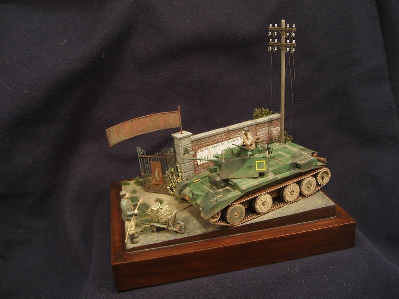
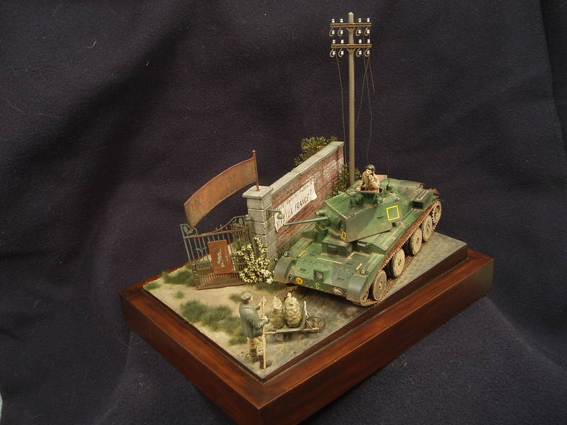
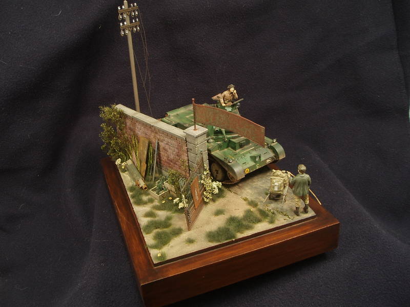
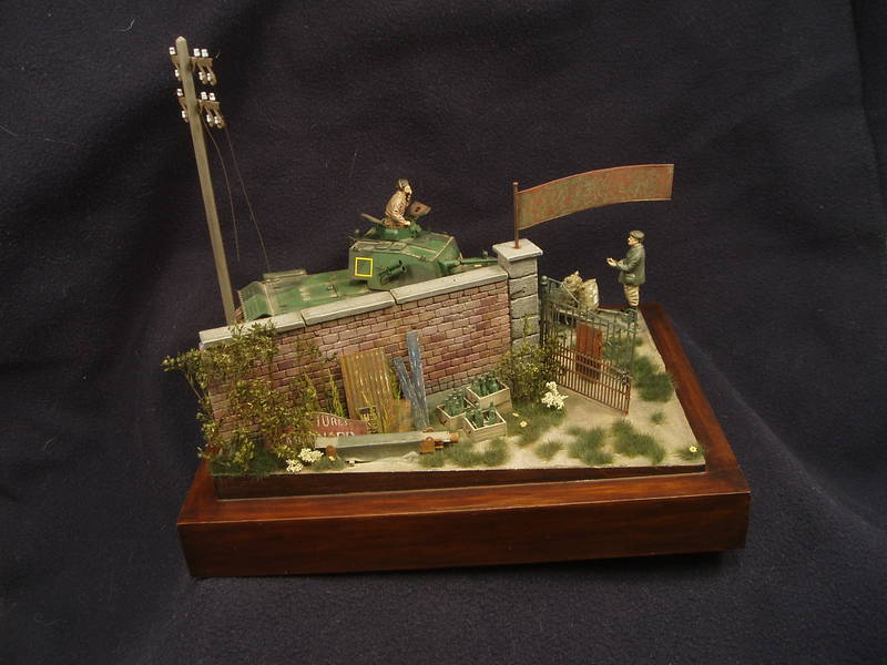
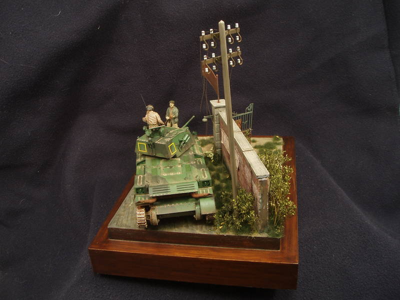
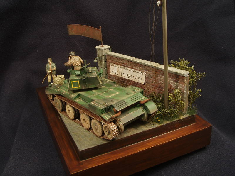
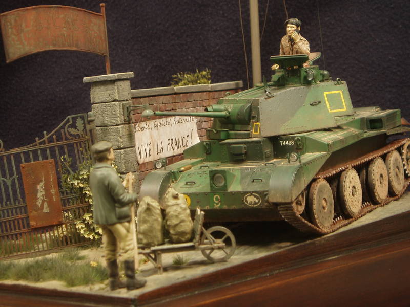
In the winter vacation I finaly finished this diorama called "First French".
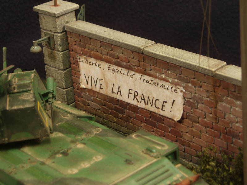
The story...Northern France 40'...the first Britisch tanks are counter attacking on the Germans. On their way accros a little town a tank commander spot on a wall a French wallpaper...the meaning of it he doesnt now...a passing farmer is helping to translate it...The British tankcommander's First French!

The Photo's.
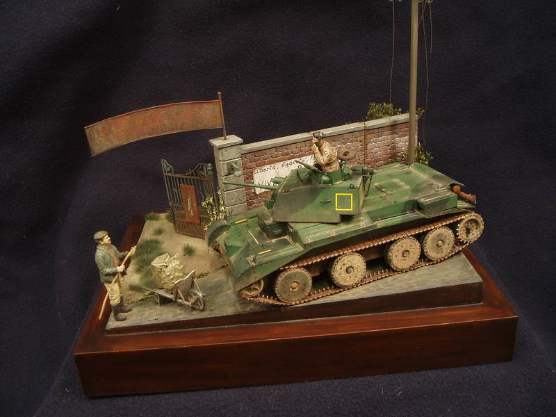


For more photo's: visit my blog's gallery...Thanks in advance

Up to the next...and this will be this one....hopping to finaly finishing this Diorama.

http://armorama.kitmaker.net/forums/126187&page=3

Greetz Nico
ElectricFactory
Visit this Community
United States
Joined: December 05, 2009
KitMaker: 90 posts
Armorama: 71 posts
Posted: Monday, January 04, 2010 - 01:50 AM UTC
Excellent work, congratulations.
exer
Visit this Community
Dublin, Ireland
Joined: November 27, 2004
KitMaker: 6,048 posts
Armorama: 4,619 posts
Posted: Monday, January 04, 2010 - 03:02 AM UTC
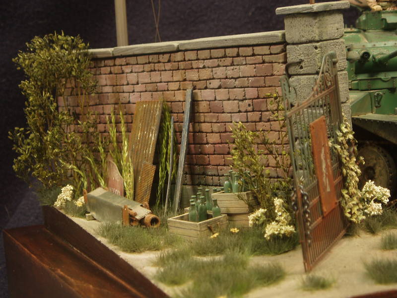
Nice work I especially like the rust on the gate. The one thing that looks out of place to me is the electric lamp on the gate pillar- it looks too small and too low to be of much use.
Everything else - the groundwork, foliage, vehicles and figures look very good.
bigal07
Visit this Community
England - East Anglia, United Kingdom
Joined: January 07, 2009
KitMaker: 887 posts
Armorama: 256 posts
Posted: Monday, January 04, 2010 - 05:34 AM UTC
Hello there, could you please tell me more about the foliage, I have several trees and varied grasses, but none look as good as your stuff.
pdelsoglio
Visit this Community
Mendoza, Argentina
Joined: November 13, 2005
KitMaker: 561 posts
Armorama: 553 posts
Posted: Monday, January 04, 2010 - 06:11 AM UTC
Congratulations on an awesome diorama! I love your groundwork! And the tank weathering is really nice too!

Cheers!
Pablo
AlanL
Visit this Community
England - East Anglia, United Kingdom
Joined: August 12, 2005
KitMaker: 14,499 posts
Armorama: 11,675 posts
Posted: Monday, January 04, 2010 - 06:44 AM UTC
Hi Nico,

Great job, I like this one a lot. Looks excelent, all round.

Only though would be the jacket and trousers of the civilian. I would have chosen different colours for some contrast and also because he's a civilian, good opportunity to make him stand out more.

Other than that excellent work indeed.

Al
bill1
Visit this Community
West-Vlaaderen, Belgium
Joined: August 14, 2005
KitMaker: 3,938 posts
Armorama: 520 posts
Posted: Monday, January 04, 2010 - 07:54 AM UTC
Yo Friends,

Thanks for the fast reply's!!

@ Jon, Thanks mate

@ Pat, I like to add a lot off detail in a diorama...the gate pillar was a bit empty...so I scratch a little lamp...nice detail I think, but you're right it should hang a bit higher...in fact the gate pillar should be bigger and higher. Thanks for you're reply

@ Alec, All the vegetation you see on the diorama is from Joefix Studios...a Belgian manufacturer... http://www.joefix-studio.be/producten.asp Just take a look on the site...very nice stuff.

@ Pablo, Thanks friend

@ Alan, You also thanks for the nice words...about the fig...painting figs is not my cup off tea surrtenly the faces...the farmer...I painted him like he is on the boxart


Thanks guy's!! realy appriciated you're reply's

Greetz Nico
JohanDeWit
Visit this Community
Netherlands
Joined: January 03, 2010
KitMaker: 23 posts
Armorama: 12 posts
Posted: Monday, January 04, 2010 - 01:17 PM UTC
Hello Nico,

A very fine piece of work indeed!

Some criticism too, the famous two cents...

As a graphic designer, I'm particularly sensitive for type and such. Therefor two remarks about the streamer/banner: it is very difficult to make a good 'bad' banner. Yours still looks a bit like a written note. When people make a protest banner, they don't 'write' but 'draw' (letter shapes). (Obvious typos in banners are due to just that: you don't drop letters when you write then, but you do when you draw them.)

Tip: take a big felt tip marker, or an actual paint brush, write your text about 10 times on a big sheet of paper, pick the best version and scale it down on a photo copier, or through scanning and printing.
'
Your text will look a lot more 'real' than it does now, IMO.
(I'd be glad to help you with that, in case you'd like me to...)

Another thing: 'Liberté, Egalité, Fraternité' is a term related to the French Revolution. Not something that was used 'contre le boche' (against the hun) during WWII

'Bas à Pétain' (Down with Pétain) or 'Bas à la boche, Vive La France' or 'Pétain = Traître' (Pétain = Traitor) would therefor be more historically correct.

But again: great dio!
GregCloseCombat
Visit this Community
California, United States
Joined: June 30, 2008
KitMaker: 2,408 posts
Armorama: 2,394 posts
Posted: Monday, January 04, 2010 - 07:50 PM UTC
Hi Nico, A nifty dio you got there. Great work!
roudeleiw
Visit this Community
Luxembourg
Joined: January 19, 2004
KitMaker: 2,406 posts
Armorama: 2,224 posts
Posted: Monday, January 04, 2010 - 09:11 PM UTC
Hi Nico, this is a great diio! Well done.

Very nice , decent , harmonizing colors, great wheatering (rust), overall superb, ....just one thing :-) , it would have been better IMO to slight the layout a bit, shorten the wall, and allow the overhanging gatearc (sp?) to stand on a second pillar instread of hanging around like this.

Very good work and Happy new Year

Claude
JohnneeD
Visit this Community
Geneve, Switzerland
Joined: February 15, 2006
KitMaker: 24 posts
Armorama: 16 posts
Posted: Monday, January 04, 2010 - 11:24 PM UTC

Quoted Text

Hello Nico,

A very fine piece of work indeed!

Some criticism too, the famous two cents...

As a graphic designer, I'm particularly sensitive for type and such. Therefor two remarks about the streamer/banner: it is very difficult to make a good 'bad' banner. Yours still looks a bit like a written note. When people make a protest banner, they don't 'write' but 'draw' (letter shapes). (Obvious typos in banners are due to just that: you don't drop letters when you write then, but you do when you draw them.)

Tip: take a big felt tip marker, or an actual paint brush, write your text about 10 times on a big sheet of paper, pick the best version and scale it down on a photo copier, or through scanning and printing.
'
Your text will look a lot more 'real' than it does now, IMO.
(I'd be glad to help you with that, in case you'd like me to...)

Another thing: 'Liberté, Egalité, Fraternité' is a term related to the French Revolution. Not something that was used 'contre le boche' (against the hun) during WWII

'Bas à Pétain' (Down with Pétain) or 'Bas à la boche, Vive La France' or 'Pétain = Traître' (Pétain = Traitor) would therefor be more historically correct.

But again: great dio!


Nico: Great Dio...love it...I love the composition and the rust effect, really well done, congrats

Jan, good tip for the banners, thanks...
correct French spelling: A bas Pétain, A bas les Boches (Boches being a derogatory term for Gemans), they also used to call Germans, Doryphores, which is an potatoe eating insect!!!
kaiserine
Visit this Community
Rhone, France
Joined: April 14, 2008
KitMaker: 383 posts
Armorama: 320 posts
Posted: Monday, January 04, 2010 - 11:31 PM UTC
Hi Nico!

Some really great stuff there and some great comments.
I like the way you're dealing with composition, that's the same for the other one, the Afrika korps and down plane one!
Various effects are also well mastered.
Congrats!

Alexandre.

PS : Is modelling the official hobby of Graphic Designers? We're a lot hanging around in KM!
bill1
Visit this Community
West-Vlaaderen, Belgium
Joined: August 14, 2005
KitMaker: 3,938 posts
Armorama: 520 posts
Posted: Tuesday, January 05, 2010 - 03:44 AM UTC
Yo Guy's,

Thanks a lot for the indeed great comments

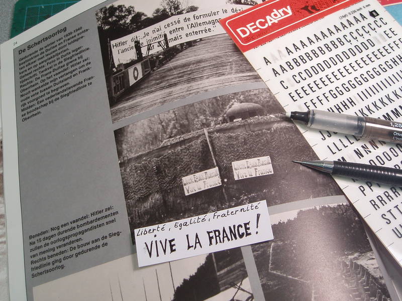
@-Jan, You're absolute right about the font of the banner...a bit strange if you see it for the first time, I agree...but I used a ref pic for the banner.


The banner you see on the pic is one of the first attempts...and as you can see they used a "font" ore "style" for the words, also the 'Liberté, Egalité, Fraternité' text is on the banner in the real photo. Photo was taken during the "schertsoorlog" between France and Germany in 39'-40'...as I see it now I think my first attempt is better than the final one
The tip you give to make a banner is great...hey, and I still do like you

@-Greg, Thanks for the nice words mate!

@-Claude, I wanted to leave an "open" look in...so the viewer will be attracted to see behind the wall...when I used a " full " wall whit a gate in the middle I think the dio will be cut in two...the front and the back are now more in one piece....that was my idea. Thanks for you're reply and the nice words.

@-Alexandre, Thanks for the nice reply...yes the "Staubige grenzen" diorama is almost ready to...final steps to be taken...

Tanks for the fast reply's.

Greetz Nico
Gundam-Mecha
Visit this Community
England - South East, United Kingdom
Joined: August 05, 2009
KitMaker: 1,019 posts
Armorama: 933 posts
Posted: Tuesday, January 05, 2010 - 06:10 AM UTC
Great work!

Very characterful, although I must say as an Englishman i'm sure we could all understand the banners famous "vive la france" and the other words are very close to the english anyway!

bill1
Visit this Community
West-Vlaaderen, Belgium
Joined: August 14, 2005
KitMaker: 3,938 posts
Armorama: 520 posts
Posted: Tuesday, January 05, 2010 - 06:23 AM UTC
Yo Jon,

I think that the British tankcommander is from the far, far North of England

Thanks for the lookies Jon!

Greetz Nico
Kuno-Von-Dodenburg
Visit this Community
England - North, United Kingdom
Joined: February 20, 2007
KitMaker: 1,453 posts
Armorama: 1,319 posts
Posted: Tuesday, January 05, 2010 - 06:29 AM UTC

Quoted Text


'Bas à Pétain' (Down with Pétain) ............... or 'Pétain = Traître' (Pétain = Traitor) would therefor be more historically correct.


NOT for Nico's time-frame here (i.e. BEFORE France surrendered).

Nico - great diorama. Love it. The way you've filled the space BEHIND the wall is very nice also.

- Steve
jba
Visit this Community
Rhone, France
Joined: November 04, 2005
KitMaker: 1,845 posts
Armorama: 777 posts
Posted: Tuesday, January 05, 2010 - 06:48 AM UTC
Blimey! i would have hate missing your new one Nico, and ace it is too! being a great rust fan i can only applaud your efforts concerning the sign above the door!
Forget about Pétain, the French loved him till '43. he was retired in may '40 before they fetch him.
Anyway, superb job between the green and the reds the colours really blend together well.
With a more ragged groundwork it would have been absolutely perfect !

slaughterman
Visit this Community
Ireland
Joined: February 25, 2009
KitMaker: 51 posts
Armorama: 48 posts
Posted: Tuesday, January 05, 2010 - 11:17 AM UTC
excellent dio
amazing work
bill1
Visit this Community
West-Vlaaderen, Belgium
Joined: August 14, 2005
KitMaker: 3,938 posts
Armorama: 520 posts
Posted: Wednesday, January 06, 2010 - 01:14 AM UTC
Yo Guys,

Tanks again for the replys!

@-Thanks Steve...glad you take a look around the wall

@-Jba, Thanks for you're reply!
Quoted Text

With a more ragged groundwork it would have been absolutely perfect !

Whitcht aspect of the groundwork should be more ragged? Under the gate?

@-Gerard, Thanks mate!

Greetz Nico
jba
Visit this Community
Rhone, France
Joined: November 04, 2005
KitMaker: 1,845 posts
Armorama: 777 posts
Posted: Thursday, January 07, 2010 - 10:31 PM UTC

Quoted Text

Whitcht aspect of the groundwork should be more ragged? Under the gate?


Nothing more than meets the eye. You are doing a patched groundwork with some grass, when it's looking like that it's that it's been *tramped* by a lot of feet, so when it's tramped, the grass doesn't look that straight nor does it look that gree,n, there is an interpenetration of the colours between sand and green.
Then if it's NOT tramped, the grass should cover the whole surface. Then when you open such a farm gate, you often drag some little stones while doing so which imprint a sort of circular pattern on the ground etc etc
Alors we are in May/June so the grass would be an okay colour, but the earth looks quite dusty me thinks, just like in august. So I would have put some humidity patches here and there.
really, nothing more than meets the eye.
I permit myself this sort of harder review than I would have normally done for one reason: I think some parts of your dio are truly handsome, and prove that you have the right eye for diorama making which is allowed to very few. So now just generalize this to the whole of the diorama

bill1
Visit this Community
West-Vlaaderen, Belgium
Joined: August 14, 2005
KitMaker: 3,938 posts
Armorama: 520 posts
Posted: Friday, January 08, 2010 - 05:56 AM UTC
Yo Jba,


Quoted Text

Then if it's NOT tramped, the grass should cover the whole surface. Then when you open such a farm gate, you often drag some little stones while doing so which imprint a sort of circular pattern on the ground etc etc


Indeed, the ground isn't tramped...the gate represent an old beer factory...abandoned for many years...not much people entered it. But you're right about the groundwork and grass. There should be more grasses ore more texture in the ground...yes...long and short grasses under the arch....various green colors to create a nice depth. Nice tip!


Quoted Text

I permit myself this sort of harder review than I would have normally done for one reason: I think some parts of your dio are truly handsome, and prove that you have the right eye for diorama making which is allowed to very few. So now just generalize this to the whole of the diorama


Thanks Jba, these are realy nice words for me, I need this to cary on and give me mutch more self-confidence....harder review you say...thats the review I need...only by such reply I can become better in making diorama's. I learnt a lot from this work...so on to next with more knowledge!

Thanks again Jean-Bernard André.

Greetz Nico
 _GOTOTOP