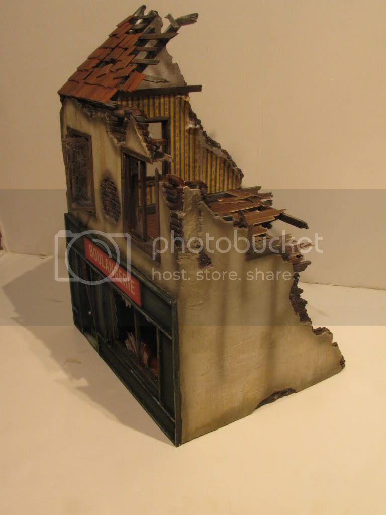
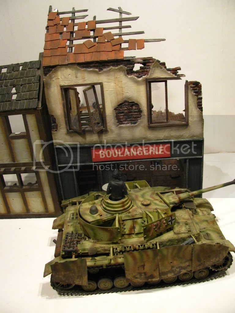
there is only one thing to constructively criticize upon my freind.; The sign for the bakery does not look like it is from the time period. The font looks like a more modern typeface, something one would see in the 1970s, when more block like fonts became more in style. An educated guess would put the construction of the prototype of this building, and the erecting of the sign somewhere in between 1900 and world war 2, and there were many different styles of lettering that were popular during that time. while i could not find any photgraphs online of bakeries, i did find some other french signs from the time period.
A car dealership in 1930s france:
http://www.emercedesbenz.com/Images/Aug08/19_Mercedes_Benz_Supercharged_Cars_1/467473_803156_3539_2519_10679237131.jpg1920s paris:
http://upload.wikimedia.org/wikipedia/commons/thumb/c/c4/Paris_Montmartre_in_1925.jpg/600px-Paris_Montmartre_in_1925.jpgIt is very nitpicky i know, but the sign's font kind of detracts from the look that french towns had around the time period.
If you made the sign with a printer, i'm sure that there are plenty of free fonts online that look the part.
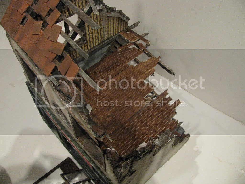
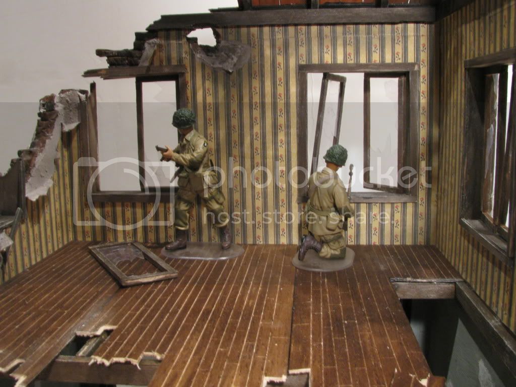
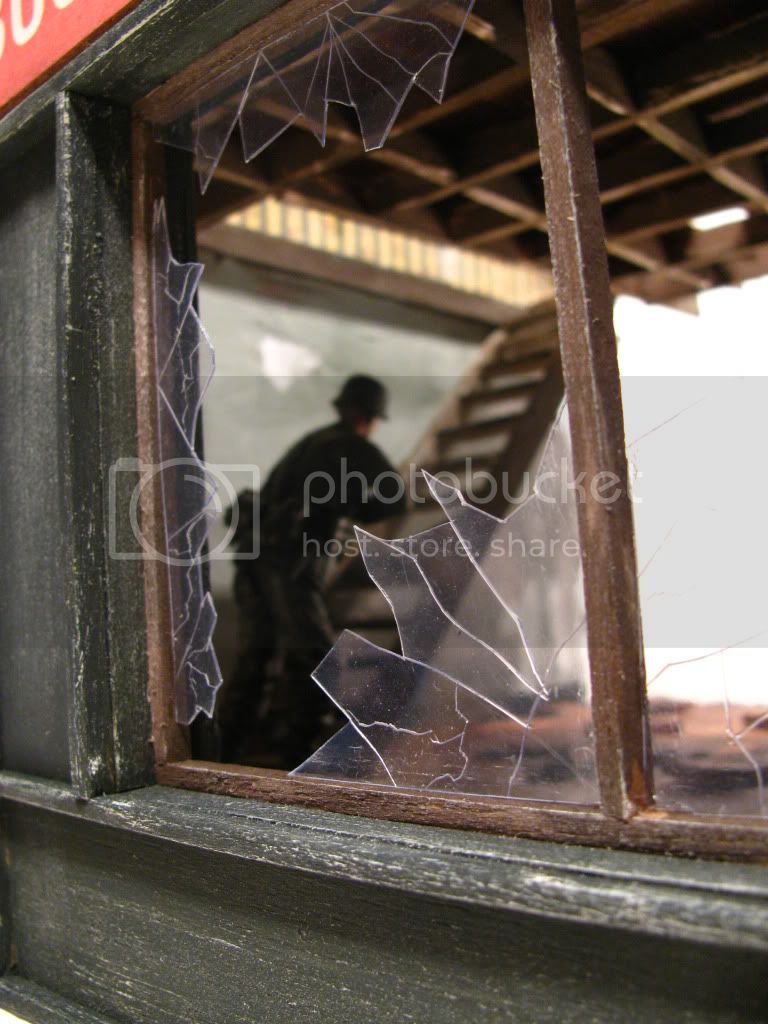
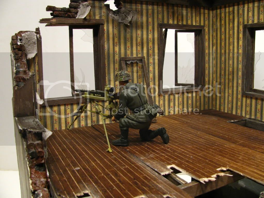
Other than that, the bakery looks very well done, and i cannot wait to see it in a diorama and with rubble, ovens, and a few stale croissants on the counter.