_GOTOBOTTOM
Dioramas: Beginners
A good place to look if you are just starting out.
Hosted by Darren Baker
Afrika Korps Dio
posty1978
Visit this Community
Karnataka, India / भारत
Joined: April 15, 2010
KitMaker: 186 posts
Armorama: 161 posts
Posted: Sunday, August 11, 2013 - 12:08 AM UTC
Hi, greetings from India...
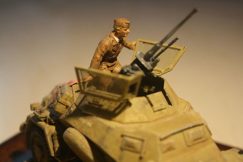
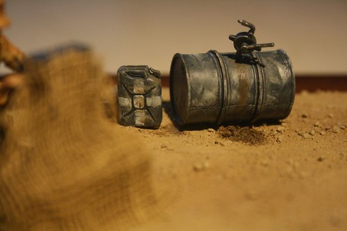
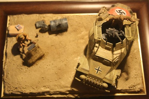
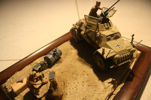
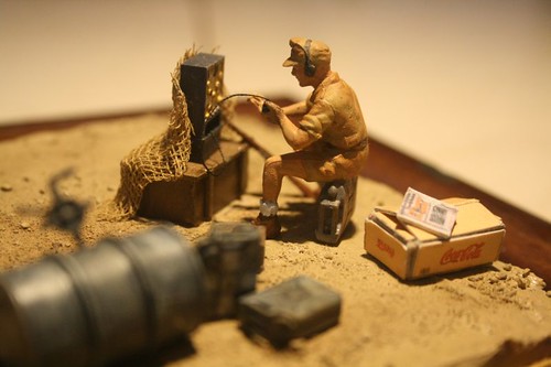
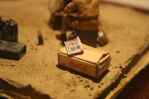
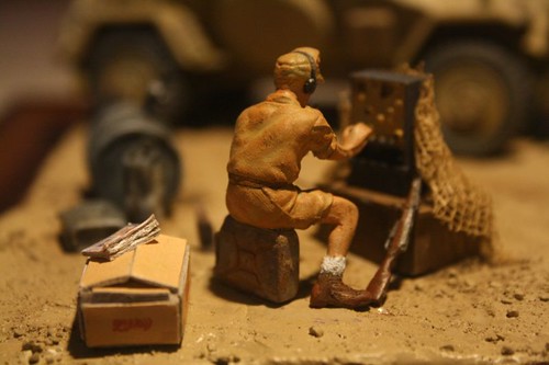
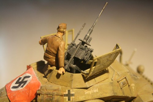
Built a Afrika Korps dio with Tamiya kits..hope you folks will like it...the coke crate (scratch built) was lying in my stash and thought will add it to this dio, this could be one inaccuracy...the bottle is made from a pen refill


IMG_7543 by dioramaposty, on Flickr


IMG_7542 by dioramaposty, on Flickr


IMG_7539 by dioramaposty, on Flickr


IMG_7536 by dioramaposty, on Flickr


IMG_7535 by dioramaposty, on Flickr


IMG_7531 by dioramaposty, on Flickr


IMG_7530 by dioramaposty, on Flickr


IMG_7529 by dioramaposty, on Flickr


IMG_7528 by dioramaposty, on Flickr


IMG_7527 by dioramaposty, on Flickr

velotrain
Visit this Community
Massachusetts, United States
Joined: December 23, 2010
KitMaker: 384 posts
Armorama: 320 posts
Posted: Sunday, August 11, 2013 - 12:31 AM UTC
Sudeep - I like all of the elements, but not the base.

First of all, it's much too small, being unable to fully contain the vehicle. Then there's that gold border which is really distracting - especially when it creates a reflection in the photo. I don't know how you made the "earth", but on the edges it has a soupy look, that causes it to look very artificial.

I don't understand why people use picture frames, and the design of this one - not to mention it's proximity - helps prevent the dio from looking like a realistic scene. Again, the modeling is very fine in all aspects, but I think you need to figure out a better presentation. YMMV
posty1978
Visit this Community
Karnataka, India / भारत
Joined: April 15, 2010
KitMaker: 186 posts
Armorama: 161 posts
Posted: Sunday, August 11, 2013 - 12:50 AM UTC
Thanks Charles will keep that in mind
All_You_Can_Kit
Visit this Community
Jakarta Raya, Indonesia
Joined: August 22, 2012
KitMaker: 599 posts
Armorama: 527 posts
Posted: Sunday, August 11, 2013 - 01:09 AM UTC

Quoted Text

...that gold border which is really distracting - especially when it creates a reflection in the photo...


Hi Sudeep, agree with Charles, and furthermore IMO such picture frame which has border line with special color (e.g. gold, silver, etc.) more suitable for another purposes (e.g. displaying photos as its' original function, of course! )

...unless you wipe out such border by simply remove the panel lines out of the mainframe or if impossible, simply cover it with spray paint with neutral look for your diorama and/or vignette.

Other than that, once again you already express your beautiful talent, especially when creating the so-dry-lookin' ground base, more and more!

Cheers


Garry
easyco69
Visit this Community
Ontario, Canada
Joined: November 03, 2012
KitMaker: 2,275 posts
Armorama: 2,233 posts
Posted: Sunday, August 11, 2013 - 01:12 AM UTC
nice! Is that a "skin-mag"? lol
All_You_Can_Kit
Visit this Community
Jakarta Raya, Indonesia
Joined: August 22, 2012
KitMaker: 599 posts
Armorama: 527 posts
Posted: Sunday, August 11, 2013 - 01:20 AM UTC

Quoted Text

...I don't understand why people use picture frames...


Hi Charles, I already become the 'people' you may be mean with it IMO and so far in this hobby, honestly just for the instant usage. Furthermore, when you face so much products displayed in your local book or stationary store, it may make you become so confuse to pick the best of them, the cheaper among them, bla bla bla... finally not choosing, just take one of them blindly!

But of course I also remind myself to modify the frame as needed (as I stated before, remove the lines if possible) in order to get the best display of the overall final result, not only the diorama and/or vignette elements, but also the aesthetic aspect of it.

Just the way I get it so far and nice opinion from you mate Have a nice modelling time Charles!


Best regards


Garry
1stjaeger
Visit this Community
Wien, Austria
Joined: May 20, 2011
KitMaker: 1,744 posts
Armorama: 1,727 posts
Posted: Sunday, August 11, 2013 - 11:42 AM UTC

Hi Sudeep,

must unfortunately agree with the others when it comes to the base.
The vehicle is fine and so are the accessories, but the colour of the uniform is wrong IMHO. I don't know if it's the lighting and colour balance of the photo, but Afrika Korps uniforms were more greenish than anything else. This greenish grey then faded to a very pale cream/yellowish grey.

Keep up the good work!!

Cheers

Romain

posty1978
Visit this Community
Karnataka, India / भारत
Joined: April 15, 2010
KitMaker: 186 posts
Armorama: 161 posts
Posted: Sunday, August 11, 2013 - 10:03 PM UTC
Thanks for the comments Romain...the color was depicted on the Tamiya box and I used it as a ref..maybe the print on the box was wrong
velotrain
Visit this Community
Massachusetts, United States
Joined: December 23, 2010
KitMaker: 384 posts
Armorama: 320 posts
Posted: Sunday, August 11, 2013 - 10:39 PM UTC

Hello Garry -

Despite what I said, I do realize that it is largely a matter of convenience - and cost. Instead of cutting pieces of quality wood and then gluing it together for a base, it is much easier to just select a ready-made frame. In this particular case, besides it being too small, I think the style of it also gets in the way of your dio. The curved shape of the frame elements distracts the eye from your work, which should be the focus. I think it also presents a confusing message, because you have created this scene of northern Africa, but we naturally associate the frame with something else, and for me this creates the conflict. One other thing that this does: you work to make your diorama three-dimensional, but such a frame suggests that it surrounds a 2D work of some sort, so it "grounds" the dio and decreases it's ability to achieve height. At a minimum, I'd encourage getting a frame that is large enough for what it contains, and has a plainer and more narrow profile - you don't want it competing for attention against your work.

I have another, more general issue. I'm not understanding why these skilled craftspeople, who spend many hours building and modifying kits, painting if not rearranging figures, and working hard to provide just the right weathering and finishing effects, are then willing to be lazy and place their work in what is often a cheap, common frame. To my view, the base is better the closer it gets to being invisible, because the extent to which it is visible is also how much potential it has to distract from your work/dio.

Another possibility is to create your own base, but not trying to make it a picture frame. Perhaps use other materials besides finished wood, maybe trying to create a base that supports what you are trying to achieve with the dio, instead of distracting the viewer from it. Try to select materials and a design that complement the dio. It may not even need to be solid. If you are interested in presenting the dio as a small slice of a different reality, try to make a base that lets it "float in space" to some degree, so that it can further isolate from everything else around it - either where you live, or from all the other dios next to it at a show. Try unusual materials, but that will work with the dio.

Let me suggest something else - a different approach to placing the scene on the base. I found this photo about a week ago among many images of a European show.
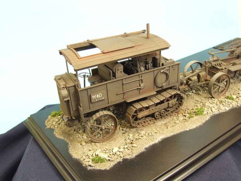


By using this technique, the modeler has assured that his scene doesn't run the risk of being defined by the rectangular edges of his base. By doing this, he is controlling where your eyes look, or perhaps more accurately, where they don't look. Defining the outer limits of the dio by the extent of the scenery material, he makes certain that the scene ends before the hard, straight lines of the actual base. This actually reminded me of photographs I had seen years ago of a most unique model railroad designed to travel to exhibitions.


By painting all areas where there is no track a flat black, the builders have clearly defined where they want people to look, and the layout stands out by contrast. One note here is that they have complete control of the lighting, while you're not going to always have that for your dio - especially if you bring it to a show, unless it's self-contained in some sort of shadow-box display.

Charles
All_You_Can_Kit
Visit this Community
Jakarta Raya, Indonesia
Joined: August 22, 2012
KitMaker: 599 posts
Armorama: 527 posts
Posted: Monday, August 12, 2013 - 08:03 AM UTC

Quoted Text


Hello Garry -

Despite what I said, I do realize that it is largely a matter of convenience - and cost....

...you work to make your diorama three-dimensional, but such a frame suggests that it surrounds a 2D work of some sort, so it "grounds" the dio and decreases it's ability to achieve height...

...you don't want it competing for attention against your work...

...I have another, more general issue. I'm not understanding why these skilled craftspeople, who spend many hours building and modifying kits, painting if not rearranging figures, and working hard to provide just the right weathering and finishing effects, are then willing to be lazy and place their work in what is often a cheap, common frame...

...Try unusual materials, but that will work with the dio...


Wow, from now on my point of view becomes opened wider than before about a simple -for many modellers- aspect of displaying their work: the base Sure, I will prepare it better for future projects, not again to pick an instant action Thanks for your sharing, hope it can be useful for us to pay some attention on how important to use a well-prepared base from any aspects.

Cheers


Garry
 _GOTOTOP