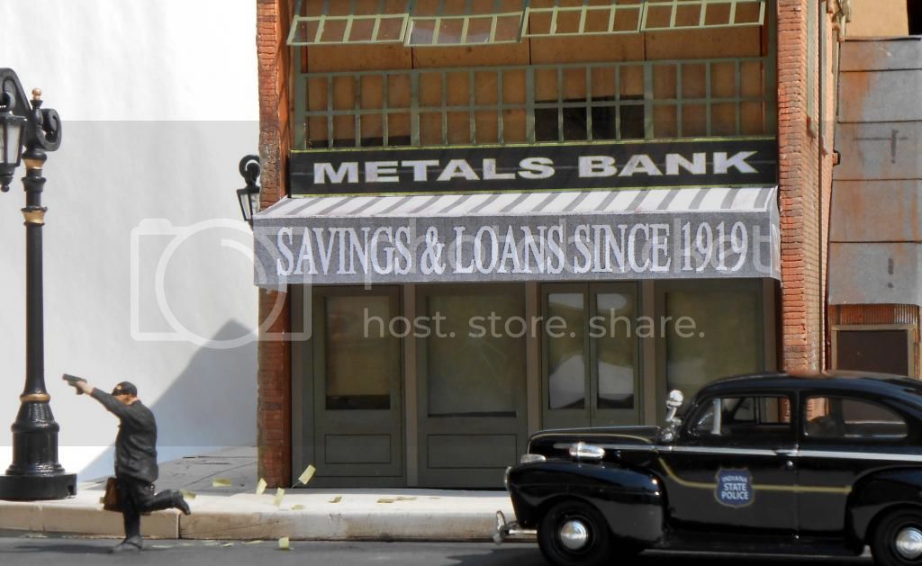
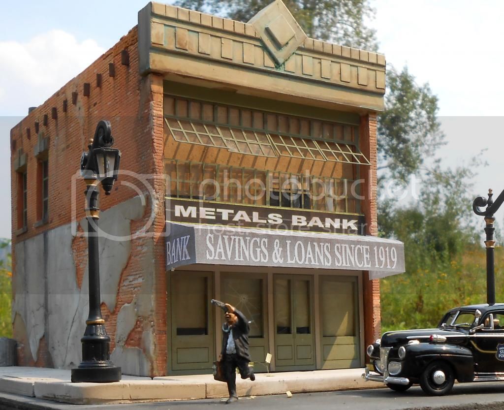
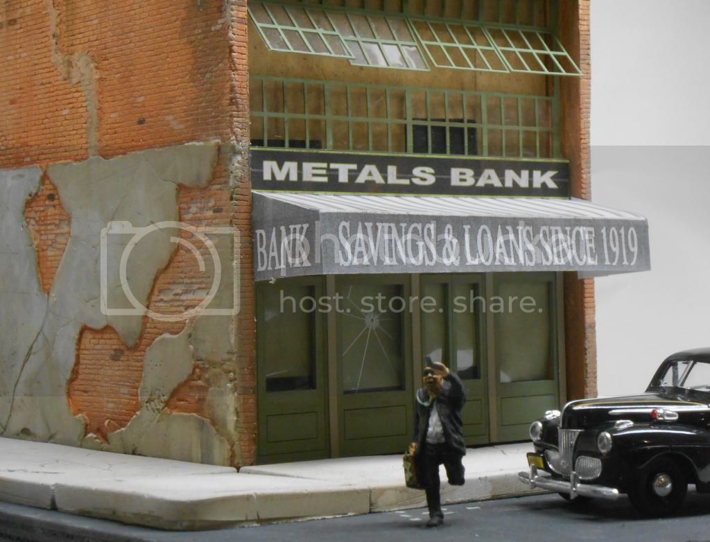
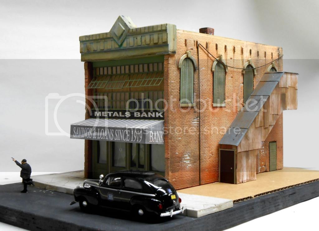
OK, it's not military but I thought you'd get a kick out of it anyway. I'm building the pilot model for our new O Scale kit & once I added the laser cut bullet hole in the glass I just had to go all the way. : ) Cutting the tiny money & stuffing it in the miniscule briefcase was kind of hard, but worth the effort IMO. It's not quite done yet but I hope you like what I've got done so far.
Randy Pepprock
Downtown Deco
Dioramas Plus
Dioramas
Do you love dioramas & vignettes? We sure do.
Hosted by Darren Baker, Mario Matijasic
Bank robbery.
downtowndeco
Vendor
Montana, United States
Joined: December 08, 2005
KitMaker: 306 posts
Armorama: 272 posts
Joined: December 08, 2005
KitMaker: 306 posts
Armorama: 272 posts
Posted: Friday, August 23, 2013 - 05:44 PM UTC
gogs007
Scotland, United Kingdom
Joined: February 03, 2007
KitMaker: 313 posts
Armorama: 285 posts
Joined: February 03, 2007
KitMaker: 313 posts
Armorama: 285 posts
Posted: Friday, August 23, 2013 - 09:45 PM UTC
That looks great
Posted: Friday, August 23, 2013 - 09:50 PM UTC
That is really cool work. And inspirational as well I'm working on and off on a similar scene with Bonnie and Clyde. Currently still working on their Ford
1stjaeger
Wien, Austria
Joined: May 20, 2011
KitMaker: 1,744 posts
Armorama: 1,727 posts
Joined: May 20, 2011
KitMaker: 1,744 posts
Armorama: 1,727 posts
Posted: Friday, August 23, 2013 - 10:36 PM UTC
Hi Randy,
never mind the non-military side...it's really cool!!!
Your brickwork looks just so realistic..!!!!
Well done Sir!!
Cheers
Romain
roudeleiw
Luxembourg
Joined: January 19, 2004
KitMaker: 2,406 posts
Armorama: 2,224 posts
Joined: January 19, 2004
KitMaker: 2,406 posts
Armorama: 2,224 posts
Posted: Saturday, August 24, 2013 - 01:13 AM UTC
I like it, nice idea !
The building looks great also.
One comment regarding the font you used, especially the "Metals Bank" . It looks modern, too modern.
Just to say as I got the comment for one of my buildings and I indeed used a modern font instead of an old one.
I don't know what you used , but you might think of that
Claude
Spartak
Croatia Hrvatska
Joined: May 26, 2013
KitMaker: 130 posts
Armorama: 108 posts
Joined: May 26, 2013
KitMaker: 130 posts
Armorama: 108 posts
Posted: Saturday, August 24, 2013 - 02:07 AM UTC
Something new, awesome!!!!
downtowndeco
Vendor
Montana, United States
Joined: December 08, 2005
KitMaker: 306 posts
Armorama: 272 posts
Joined: December 08, 2005
KitMaker: 306 posts
Armorama: 272 posts
Posted: Saturday, August 24, 2013 - 09:48 AM UTC
Done. I added fluttering money coming from the briefcase (a tiny strand of twisted black wire w/bills glued to it), streetlights (working) & in general just put this thing to rest. I have yet to get the "perfect" picture of it, but at least you get the idea.
Cheers!
Randyu Pepprock
Downtown Deco
Dioramas Plus
Cheers!
Randyu Pepprock
Downtown Deco
Dioramas Plus