Quoted Text
Quoted Text
Quoted Text
Looks like I am the Dinosaur that's not going to survive the astroid!
No, youre not the only one Michael. Im having the same feelings, and frankly think Im going to step away from Kitmaker for a while. I had the same feelings when Hyperscale and Missing Lynx went to this same new Facebook like format. Now I have to like something or bookmark it to access it, or run through endless new comments before I find an interesting post. I suppose the new system is better for loading photos, but frankly, I really liked the idea of seeing all the postings at a glance, together for all the Kitmaker sites. So, as a fellow Dinosaur, its just too complicated to deal with for me. You know, I have a similar problem when I walk into my LHS and stare at a floor to ceiling display of model kits when theyre just jumbled together it causes me to go blank for a while. Its much easier and less chaotic when things are organized into nice groups. Perhaps Ill check in once in a while.
VR, Russ
THIS POST NEED FACT CHECKING! ('cos I don't see none of this!)
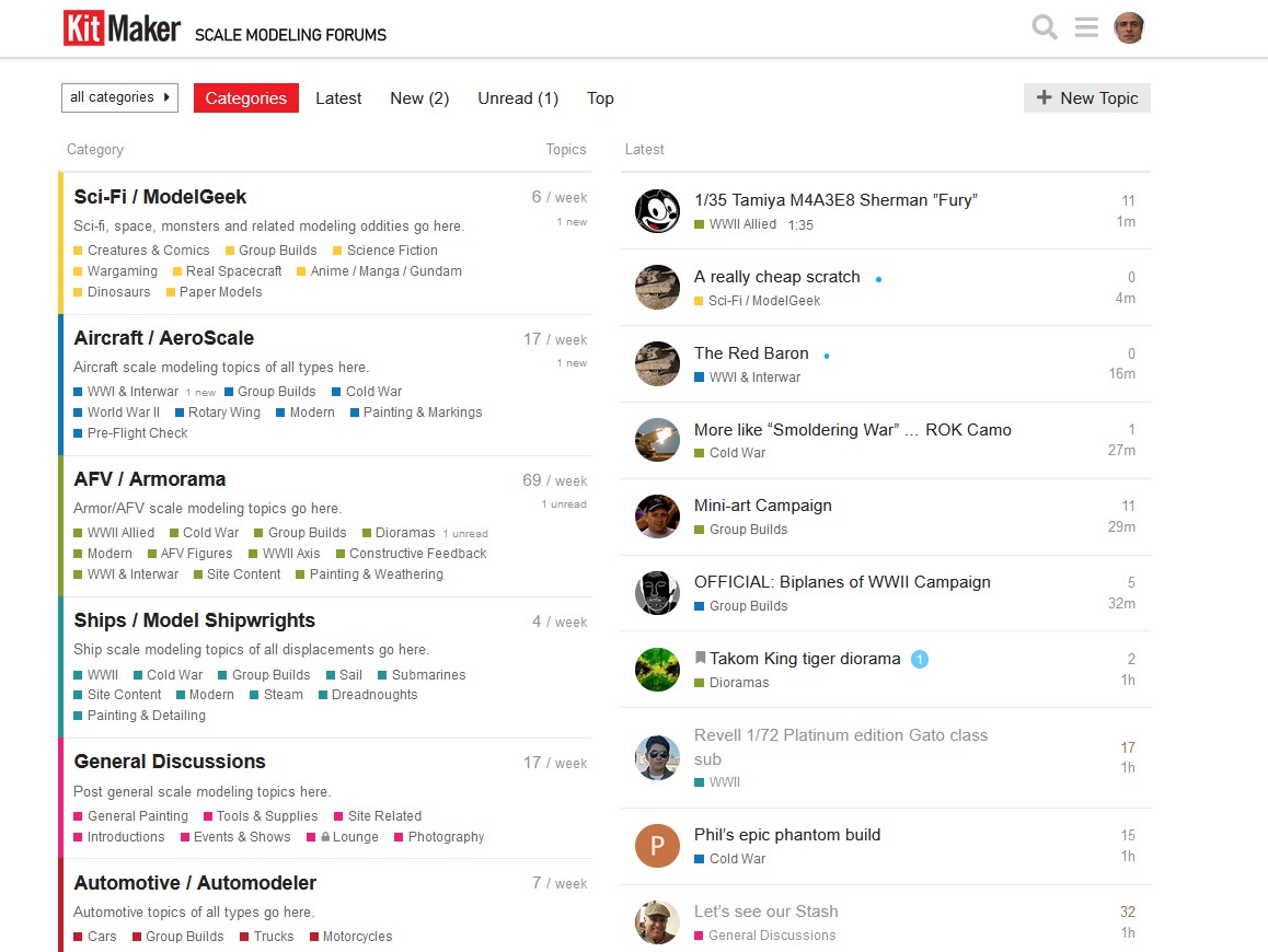
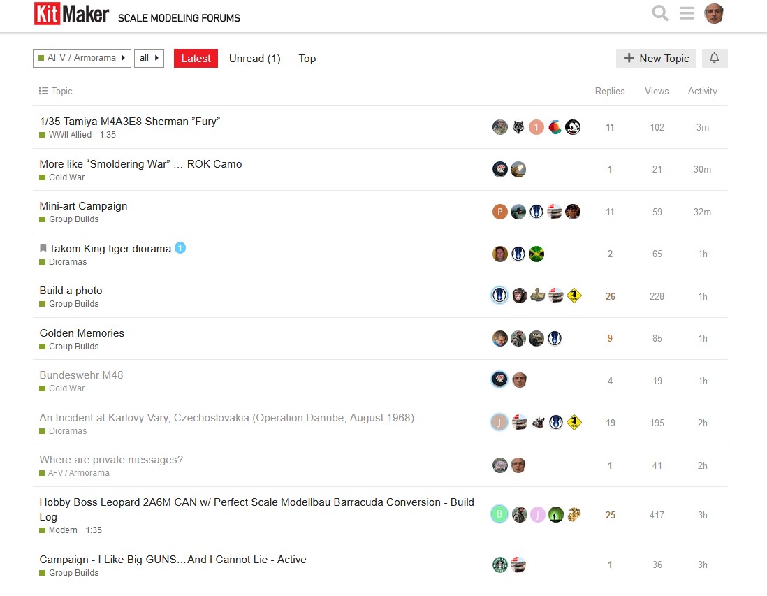
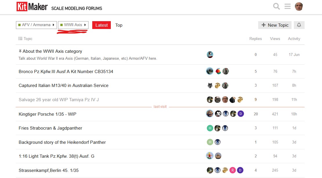
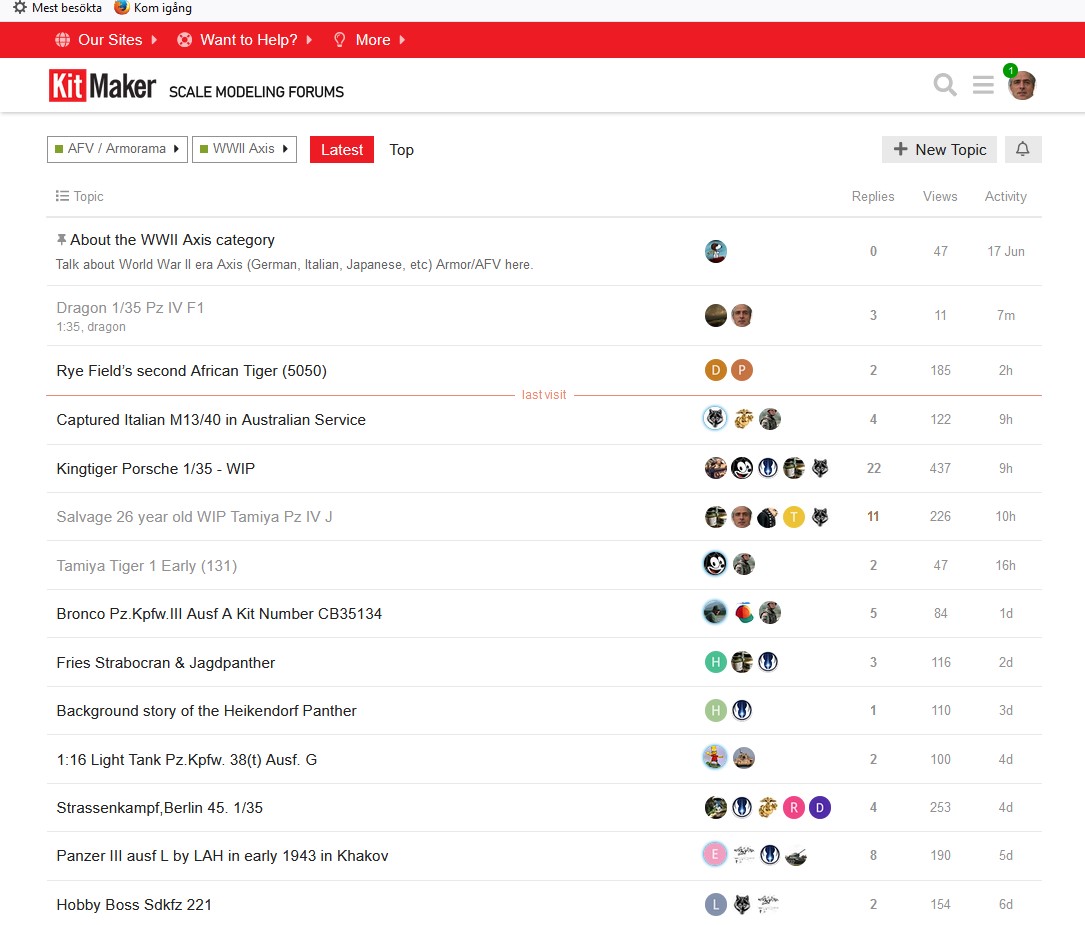
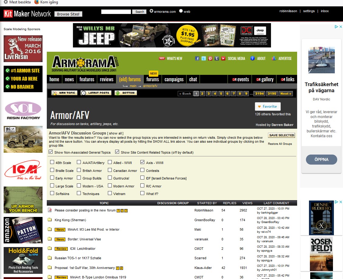
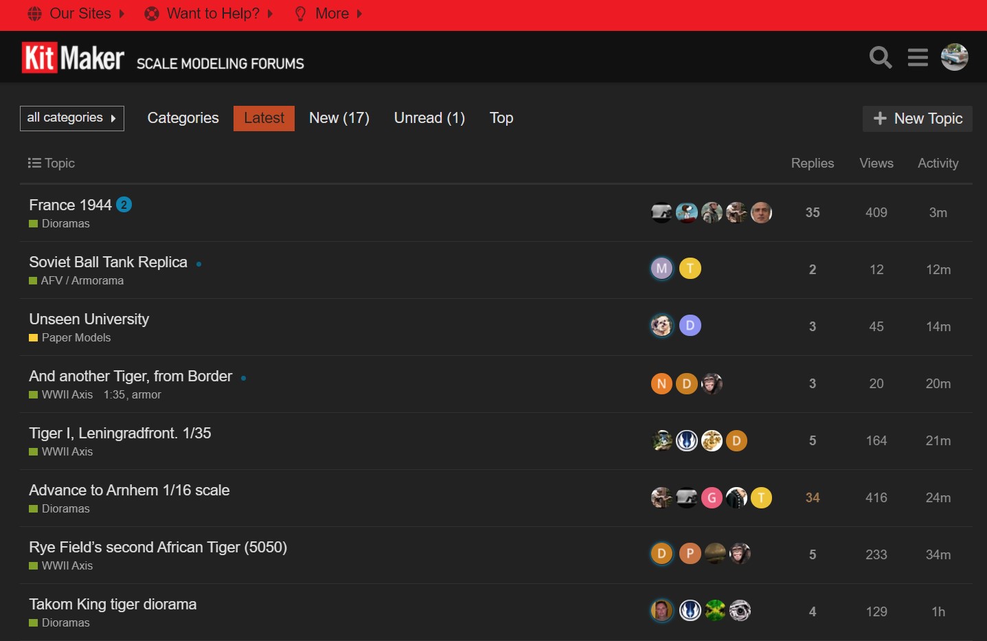
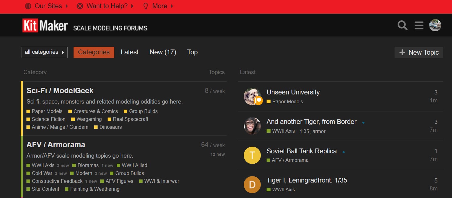
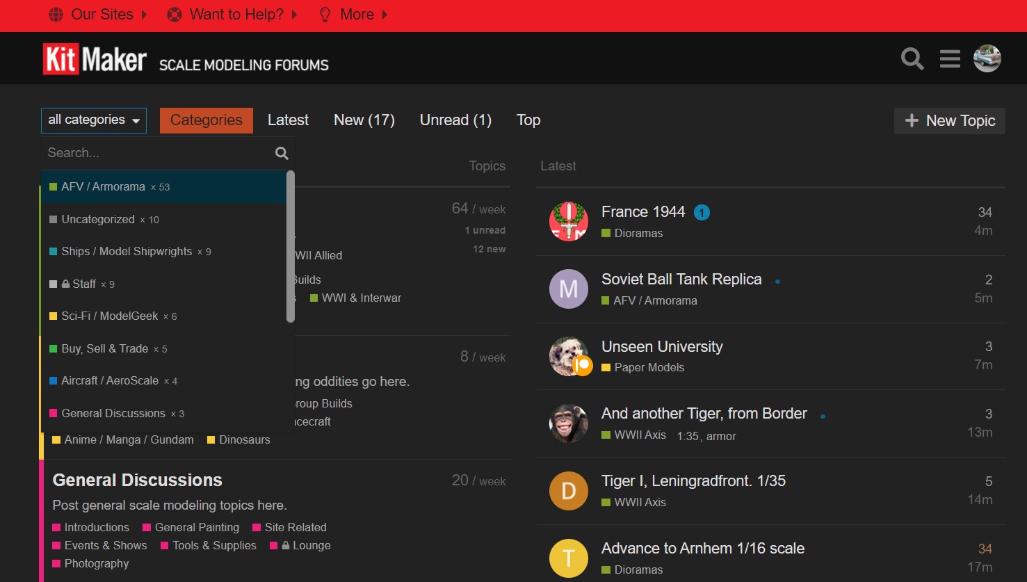
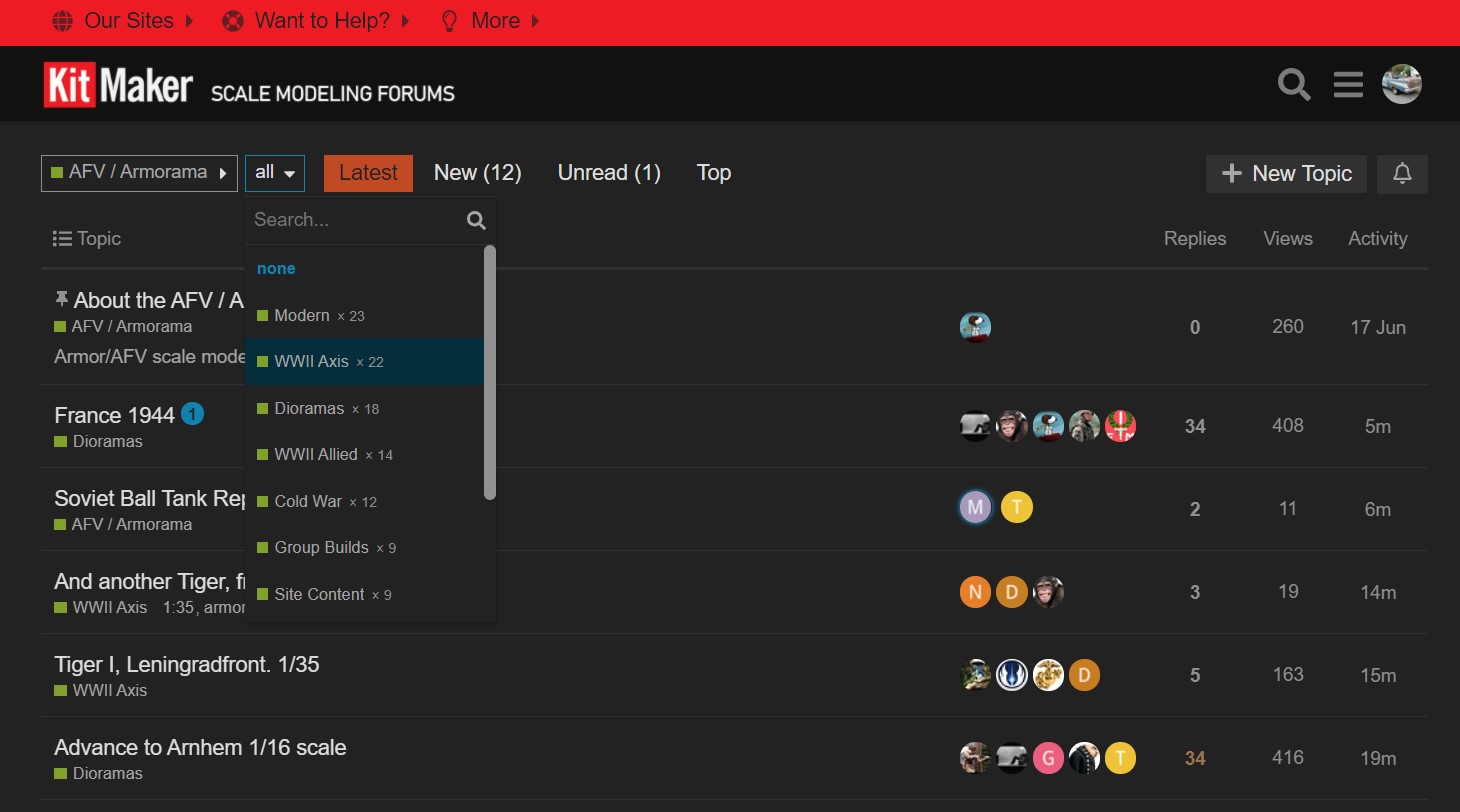
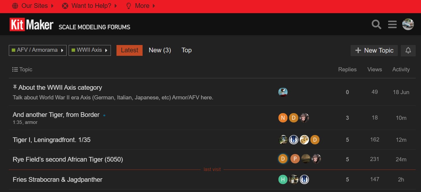
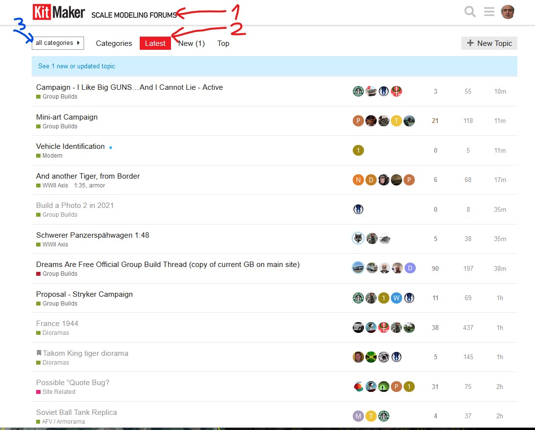
Well, how about this I went back again and had a serous look at the new forums. I still feel its not as easy or clear to look at as the old forums, nor is it easy to retrieve previously archived material. As I looked at the new forums, I realized what it is that bothers me about them:
1) There is no color coding to differentiate between Armorama, Aeroscale, Model Shipwrights, Historica Forma or the other Kitmaker sites. Part of the reason I liked the old site was I could see at a glance what area the topic was in. Thats a checked fact.
2) There were more topics available on a single page, especially the first page of the site, including New items, Features, Reviews, etc. thats a fact. Now you have to dig for them by going to that area.
Its not that the new forums are bad, its just me. I dont feel I want to spool through the site to find what I need. Perhaps if the topics where color coded like the old site, or if there was a title page with announcements, reviews or features Id feel differently. I feel for now its best to step away, and maybe come back later and see how things are progressing. I feel the same way about Hyperscale/Missing Lynx, which went to the same type of programming a couple of years ago. I still hit the announcement/features page of Hyperscale, which kept the same format for its title page, with a link to the forums. But I seldom even look at the forums anymore, as their usefulness is a running list of topics, forcing me to dig around to find anything of interest. To me, the greatest utility of the old site was the ability to ask and answer questions, and find topics again if you needed them.
VR, Russ


