The curved front is really my way of creating a visual arch in order to try to get equal balance among the figures. The back corner behind the building will more than likely be a backwards L shape - so it will eventually end up to be some form of a "D".
I think I'm going to rename it too. While I was laying in bed the other night I came up with a great name, but have since forgotten the name. I remembered the thought but forgot the details.
I think something like "Lets Compare Treasure." or "To Each His Own".
Posters are planned for the big wall.
Dioramas
Do you love dioramas & vignettes? We sure do.
Do you love dioramas & vignettes? We sure do.
Hosted by Darren Baker, Mario Matijasic
Look at This Project - slodder
slodder

Joined: February 22, 2002
KitMaker: 11,718 posts
Armorama: 7,138 posts

Posted: Thursday, September 13, 2007 - 06:43 AM UTC
beachbum

Joined: March 05, 2004
KitMaker: 1,735 posts
Armorama: 586 posts

Posted: Thursday, September 13, 2007 - 06:45 PM UTC
Scott the title you were thinking of wouldn't by any chance be something like "I'll show you mine if you show me yours....."

f1matt

Joined: August 13, 2006
KitMaker: 1,021 posts
Armorama: 805 posts

Posted: Thursday, September 13, 2007 - 06:56 PM UTC
That's a great title CK.
Good luck with your build Scott. This one has really gotten my attention. It's gonna look amazing completed.


Good luck with your build Scott. This one has really gotten my attention. It's gonna look amazing completed.


exer

Joined: November 27, 2004
KitMaker: 6,048 posts
Armorama: 4,619 posts

Posted: Thursday, September 13, 2007 - 08:27 PM UTC
Great work so far Scott.
Instead of posters what about a big painted sign, they always look well - an ad for pernod or cigarettes- something like that.
Quoted Text
Posters are planned for the big wall.
Instead of posters what about a big painted sign, they always look well - an ad for pernod or cigarettes- something like that.
slodder

Joined: February 22, 2002
KitMaker: 11,718 posts
Armorama: 7,138 posts

Posted: Thursday, September 13, 2007 - 10:23 PM UTC
CK - that's a funny title! 
Pat - maybe both a painted sign and posters.....hmmm the gears are spinning now.

Pat - maybe both a painted sign and posters.....hmmm the gears are spinning now.
cheyenne

Joined: January 05, 2005
KitMaker: 2,185 posts
Armorama: 1,813 posts

Posted: Thursday, September 13, 2007 - 10:32 PM UTC
Nice Scott, and yes he does look like Rodney.
Scott can you fill [ or partial fill ] the back of the building with rubble and broken timber ? This way you're back to 360. You may have to mess with the roof a little though.
Cheyenne
Scott can you fill [ or partial fill ] the back of the building with rubble and broken timber ? This way you're back to 360. You may have to mess with the roof a little though.
Cheyenne

Tarok

Joined: July 28, 2004
KitMaker: 10,889 posts
Armorama: 3,245 posts

Posted: Friday, September 14, 2007 - 01:46 AM UTC
Quoted Text
maybe both a painted sign and posters.....
Scott,
What about a mixture of commercial and propoganda posters and graffiti over an old, faded painted sign?
My 0.02ZAR
Rudi

slodder

Joined: February 22, 2002
KitMaker: 11,718 posts
Armorama: 7,138 posts

Posted: Friday, September 14, 2007 - 02:55 AM UTC
Rudi - that's exactally what I was thinking 

JeepLC

Joined: June 20, 2007
KitMaker: 510 posts
Armorama: 469 posts

Posted: Wednesday, September 19, 2007 - 05:52 AM UTC
That would be fantastic. The painted wall/posters would go very well with the scene and it would add even more eye-candy!
Also the damaged back wall of the buildings can simply be explained as a 'cross-section'. I'm sure noone will challenge it!
-Mike
Also the damaged back wall of the buildings can simply be explained as a 'cross-section'. I'm sure noone will challenge it!
-Mike
slodder

Joined: February 22, 2002
KitMaker: 11,718 posts
Armorama: 7,138 posts

Posted: Monday, November 05, 2007 - 11:37 PM UTC
Ok - so it's been a while and I've wrapped up a campaign project and a dangling project so I'm back to this one.
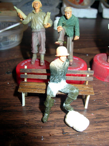
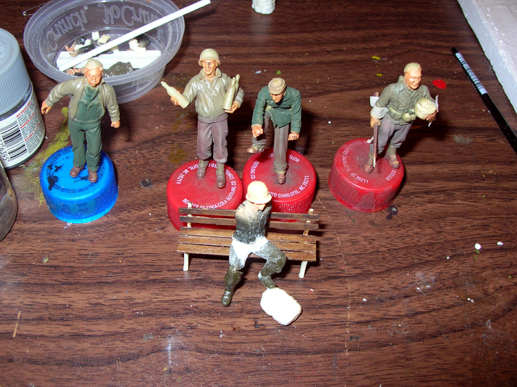
I've done a bit of work on the figures - mainly flesh tones. I've done a bunch of work on the seated figure - I've cut him at both hips the left ankle, right knee so he's coming along slow.
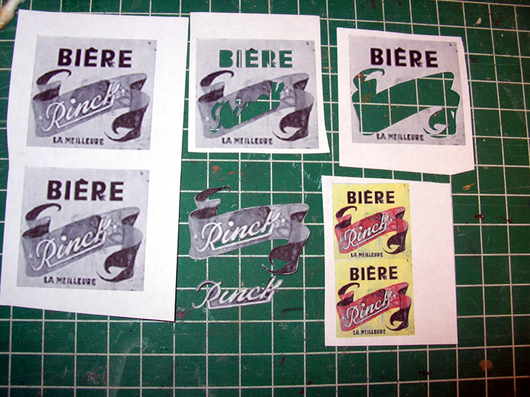
I plan on taking jba's adivce and adding a painting on the blank wall. Robert showed me a great site on outside ads and I found one I like. I used photoshop and size up a few images, then cut templates out. My plan is to use each template as a silkscreen type process to guide painting each color.

kiwibelg

Joined: August 09, 2005
KitMaker: 939 posts
Armorama: 429 posts

Posted: Tuesday, November 06, 2007 - 05:59 AM UTC
Hi Scott,
The fleshtones look very nicely done mate.I'm not sure if you checked your other thread but there is a neat method of adding pictures to walls on Ediorama under the technique (they call it technic) section.
Shay
The fleshtones look very nicely done mate.I'm not sure if you checked your other thread but there is a neat method of adding pictures to walls on Ediorama under the technique (they call it technic) section.
Shay


guygantic

Joined: August 19, 2006
KitMaker: 7,084 posts
Armorama: 970 posts

Posted: Tuesday, November 06, 2007 - 06:13 AM UTC
A beautiful diorama Scott, nice figures, well chosen. But I really like the work you put in the houses. I'm glad I saw this topic today, I almost missed it, blind me ! 
Succes with the wall decorations, I'll come here and check regularly, so battle on please ! Greetz G.

Succes with the wall decorations, I'll come here and check regularly, so battle on please ! Greetz G.

slodder

Joined: February 22, 2002
KitMaker: 11,718 posts
Armorama: 7,138 posts

Posted: Tuesday, November 06, 2007 - 08:08 AM UTC
Shay - I did see that feature on EDiroama - I'll be using it too.
I tried testing water colors to get the washed out look but wasn't satisfied with the amount of extra work to seal each color. So I will be using that
Thanks Guy - stay tuned for some more....
I tried testing water colors to get the washed out look but wasn't satisfied with the amount of extra work to seal each color. So I will be using that
Thanks Guy - stay tuned for some more....
slodder

Joined: February 22, 2002
KitMaker: 11,718 posts
Armorama: 7,138 posts

Posted: Thursday, November 08, 2007 - 12:50 AM UTC
I was sick yesterday - too sick to work, not sick enough to stay away from the bench.
Here are the results
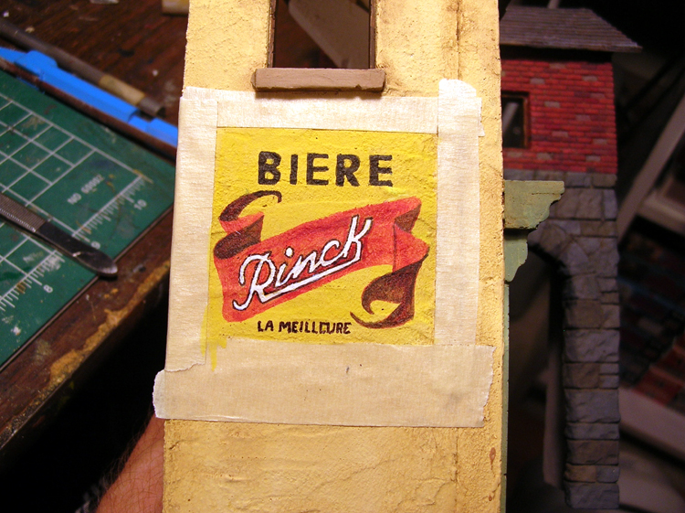
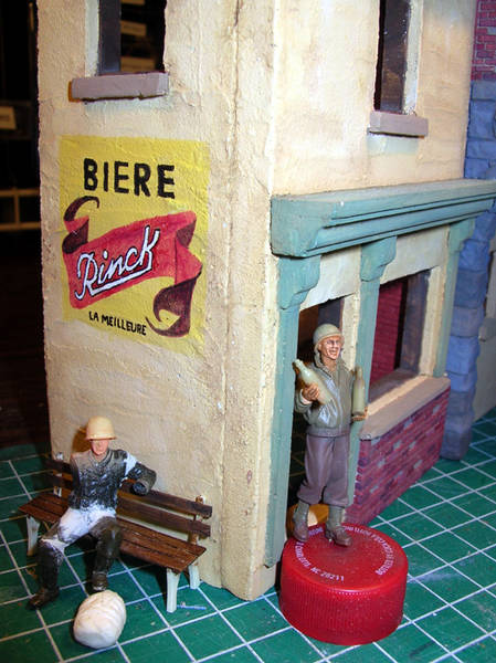
I painted the poster/ad. Still needs weathering.
I worked on the seated figure too, got the legs done and worked on the arms and hands.
I haven't seen/heard anyone talking about reworking hans of stock figures. So, here are some refreshers on how to enhance those blundt over molded poor detail sleeves. Yuo can do this with or without replacing the hands with AM hands. Use the stock hands.
Just cut off the hand, hollow out the shirt sleeve. Then use wire to reattach the hand. Use a touch of putty to fill in the wrist. You dont' want to insert the hand way up in the sleeve. The guy will come out with a short stubby arm.
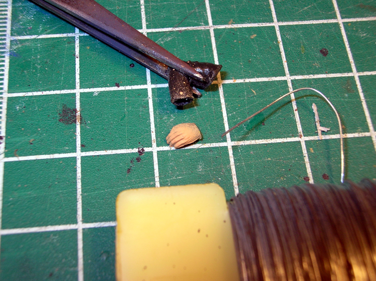
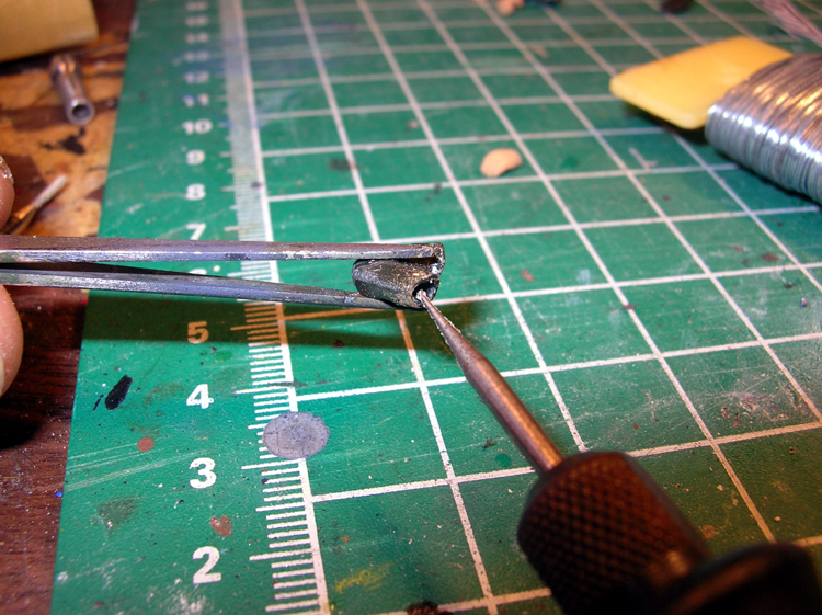
Here are the results
I painted the poster/ad. Still needs weathering.
I worked on the seated figure too, got the legs done and worked on the arms and hands.
I haven't seen/heard anyone talking about reworking hans of stock figures. So, here are some refreshers on how to enhance those blundt over molded poor detail sleeves. Yuo can do this with or without replacing the hands with AM hands. Use the stock hands.
Just cut off the hand, hollow out the shirt sleeve. Then use wire to reattach the hand. Use a touch of putty to fill in the wrist. You dont' want to insert the hand way up in the sleeve. The guy will come out with a short stubby arm.
Posted: Thursday, November 08, 2007 - 11:05 AM UTC
Hey Scott. Great job on the wall slogan. The end result is excellent ... you make it look easy. I also like the pose you created with the seated soldier. Coming along nicely!! 


f1matt

Joined: August 13, 2006
KitMaker: 1,021 posts
Armorama: 805 posts

Posted: Thursday, November 08, 2007 - 03:01 PM UTC
That sign looks fantastic.
slodder

Joined: February 22, 2002
KitMaker: 11,718 posts
Armorama: 7,138 posts

Posted: Thursday, November 08, 2007 - 03:28 PM UTC
Thanks guys coming from you two that means a lot.
Got the hands glued into the seated guy - pictures to come. Now time to paint him to catch up. Then comes the ground work.
Got the hands glued into the seated guy - pictures to come. Now time to paint him to catch up. Then comes the ground work.
bill1

Joined: August 14, 2005
KitMaker: 3,938 posts
Armorama: 520 posts

Posted: Friday, November 09, 2007 - 05:25 AM UTC
Yo Scott,
Nice work on the painting on the wall...this give some extra to the scene. Now the right weathering on it and its just like the real thing!
greetz Nico
Nice work on the painting on the wall...this give some extra to the scene. Now the right weathering on it and its just like the real thing!
greetz Nico

Posted: Wednesday, December 12, 2007 - 06:03 PM UTC
For our American, and Brits, cousins, the practise of painted advertising on the side of buildings may not be as familiar as it is to our European friends.. But let me assure you, that that advertisement looks superb.

f1matt

Joined: August 13, 2006
KitMaker: 1,021 posts
Armorama: 805 posts

Posted: Wednesday, December 12, 2007 - 08:17 PM UTC
Actually in my home town of Winnipeg, many old buildings downtown have a lot of original painted signs still. Most are almost 100 years old. They always get my attention. I guess they still work even after all these years. I'm impressed with the work you have put into the sitting figure. I've tried similar figure modifications and it ain't easy to get 'em looking right. Yours is quite nice. I love seeing all the bright colours too. A nice change from most dioramas that are out there. Makes me want to try and incorporate more colour into my next dio. Looking forward to seeing more.
-Matt
-Matt
jba

Joined: November 04, 2005
KitMaker: 1,845 posts
Armorama: 777 posts

Posted: Wednesday, December 12, 2007 - 09:10 PM UTC
very nice building advert Scott, it certainly adds a lot of colour to the side and is looking quite good ideed.
i certainly confirm what Henk and others said -a very common practise around here. You don't have to go really far in the countryside here to still find some of those really old paintings (often for alcohols though it's prohibited by law since a couple of years down there now ), their colours fade away but they still have that feeling of past popular grandeur!
i certainly confirm what Henk and others said -a very common practise around here. You don't have to go really far in the countryside here to still find some of those really old paintings (often for alcohols though it's prohibited by law since a couple of years down there now
 ), their colours fade away but they still have that feeling of past popular grandeur!
slodder

Joined: February 22, 2002
KitMaker: 11,718 posts
Armorama: 7,138 posts

Posted: Wednesday, December 12, 2007 - 11:20 PM UTC
Thanks guys - I must say, I am very pleased with how it turned out. Thanks for the push, it was you guys who wanted me to do it.
My next update - hopefully this weekend will show a CD 'wall painting' compared to this one, quite a difference. Figures, gutters, gear photos to come.
My next update - hopefully this weekend will show a CD 'wall painting' compared to this one, quite a difference. Figures, gutters, gear photos to come.
Posted: Wednesday, December 12, 2007 - 11:26 PM UTC
Its looking good scott, I carn't wait to see it completed. The wall painting does look so convincing
cheers
keith
cheers
keith
slodder

Joined: February 22, 2002
KitMaker: 11,718 posts
Armorama: 7,138 posts

Posted: Saturday, December 15, 2007 - 12:41 AM UTC
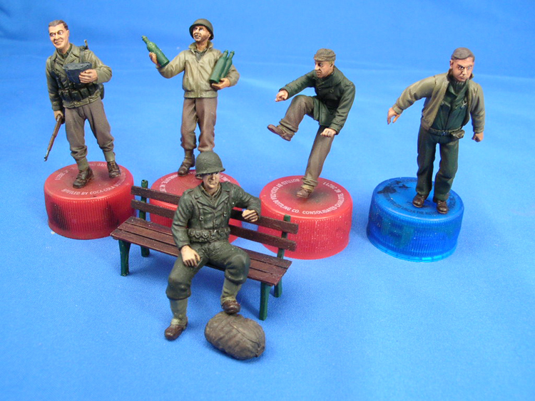
Here's the update  The figures have gotten flesh tones, pin washes, basic painting done, some second layer detailing, more details to be picked out, more gear to add for some. I need to make the cigarette bigger in the seated guys hand.
The stowage is just loose fitted. More will come and I am probably going to hide most of it with a tarp.
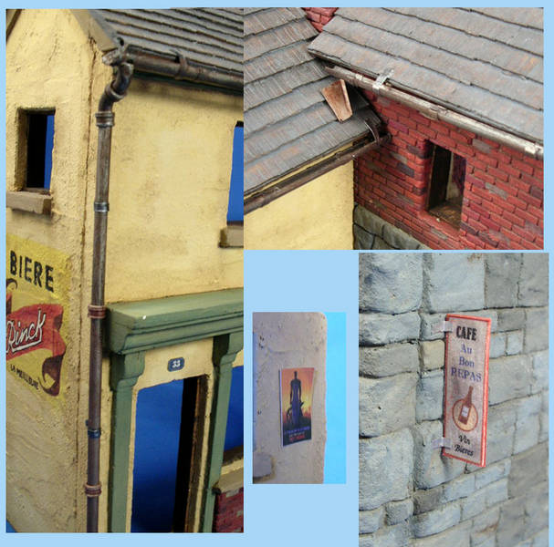
The building got a lot of attention, some CD touches in the building number and the cafe sign. The movie poster is from MiniArt. The gutters are a mix of CD plumbing fixtures and tube styrene with foil attachment points. Paint was Tamiya aluminum, then tamiya gun metal, then more aluminum, a wash of black oil, then an over coat of muddy red oil.
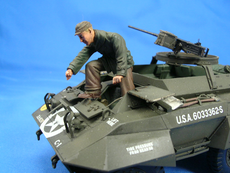
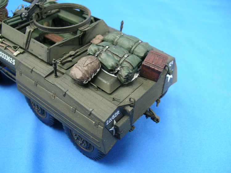
For my base I first started with a custom "D" shaped piece of MDF, but I was really dissapointed. I have to go hard wood to get a worthy 'good' base. Thats the biggest hold up right now.
 The figures have gotten flesh tones, pin washes, basic painting done, some second layer detailing, more details to be picked out, more gear to add for some. I need to make the cigarette bigger in the seated guys hand.
The stowage is just loose fitted. More will come and I am probably going to hide most of it with a tarp.
The building got a lot of attention, some CD touches in the building number and the cafe sign. The movie poster is from MiniArt. The gutters are a mix of CD plumbing fixtures and tube styrene with foil attachment points. Paint was Tamiya aluminum, then tamiya gun metal, then more aluminum, a wash of black oil, then an over coat of muddy red oil.

For my base I first started with a custom "D" shaped piece of MDF, but I was really dissapointed. I have to go hard wood to get a worthy 'good' base. Thats the biggest hold up right now.
slodder

Joined: February 22, 2002
KitMaker: 11,718 posts
Armorama: 7,138 posts

Posted: Saturday, December 15, 2007 - 12:44 AM UTC
Here is one quick photo for comparison purposes. The image on the right is a CD poster set image. The left side is my scratch painted version.
Use your imagination and think how 'thick' the paper would look. The extra work of painting a scratch version really paid off, you get the texture coming through and the weathering is really cohesive and natural.
Not that the CD poster is bad, it's just that it's more of a 'sign' vs a painting/painted ad.
 |


