OK Ill toss out some thoughts.
I understand that the OP was asking about the realism aspect, but since he also mentioned art a few times, Ill say that I have a different take there. It seems the most widely held view is that its a combination of modeling skill and the ability to create a strong emotional reaction to a diorama. Michael raised the issue of technique vs. art, which is somewhat related to the long standing argument of art vs. craft, with such areas such as ceramics, woodwork, glassblowing, fibers, etc. relegated to a lower level than the traditional fine arts of painting and sculpture. I am interested in architecture and sculpture, and dont worry much about what is or isnt art, but do largely evaluate all objects - including dioramas - using a visual and spatial scorecard.
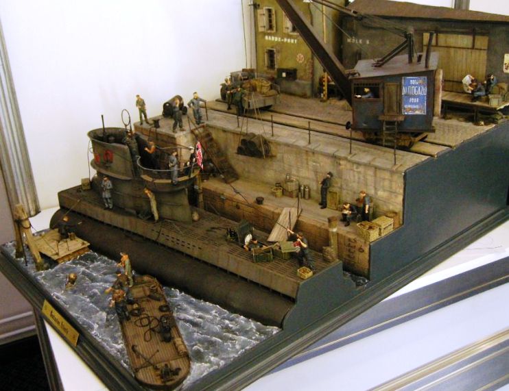
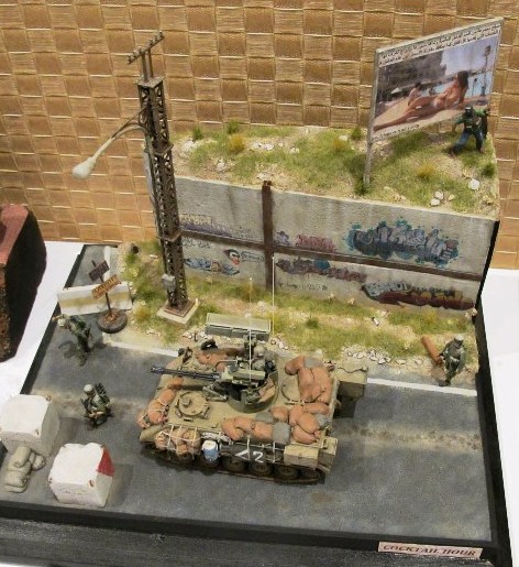
These are two dioramas that I very much admire, but for quite different reasons.

I like Destination Atlantic because I think it is extremely well designed and makes use of multiple levels, which is very unusual for dios, and it creates a visual complexity which I enjoy exploring. There are over a half-dozen mini-scenes, and you have to look at it for a while to appreciate everything that is going on. However, it does have balance and provides quiet spaces for the eye to rest, unlike say the fall of Berlin, which seems unrelentingly busy to my vision.
I have some issues with it: how realistic is it for a U-boot to be provisioning at a small French port, which wont have the protection and specific military supplies that the dedicated bases and bunkers offer. It looks like a lot of foodstuffs were delivered to the quay more quickly than they could be stowed below I suspect meant to create atmosphere, but perhaps a tad overdone. However, overall I think this diorama does an exceptional job of defining space and using it effectively, which is an important criteria for me.

While Cocktail Hour also has strong design qualities and multiple elevations, I am most attracted by the apparent normalcy of the scene, but with a chilling undercurrent. In fact, the first time I looked at the photo, it took me a minute to understand the title initially interpreting it too literally. There is no carnage or blood in the scene, but for me that makes the tension all the more real.
I would consider both of these dioramas as art, although one engages me visually and the other primarily emotionally.
As for the dark side of war, I guess I didnt realize that there was any bright side. I agree with those who argue each modeler can and should do what they wish, and that the model media shouldnt excessively legislate, while understanding the concern over children at shows. However, as I believe someone else may have suggested, those same kids might go home and play video games that are far more violent and bloody than anything at the show.
I do think depiction of the dark side has to be considered as carefully as any other aspect of the overall design. There was a recent dio posted showing a soldier with his arm blown off. Outside of the excessive and unrealistically depicted blood, most of the negative response related to the comment by the clearly immature builder that he couldnt stop laughing over it. Some of the most critical feedback was from those who had experienced combat, wondering why this kid wasted on beer thought something he knew nothing about was so amusing.
While dioramas can create a strong emotional reaction in the viewer, for myself I like to sense that there is some room for me to develop my own response, without feeling like the story is being force-fed or hammered in. A link to the concentration camp boxcar scene was posted in this thread, and while I can admire the modeling skill there, I felt that I was being emotionally manipulated by it perhaps partially due to the loaded, iconic nature of what was - indirectly - represented. For my tastes, the winter scene is an example of showing suffering, while giving the viewer more room for their personal interpretation. YMMV


