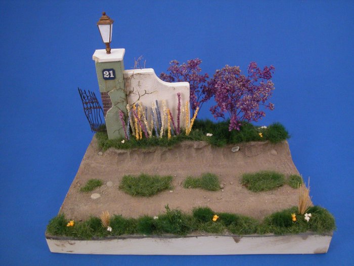
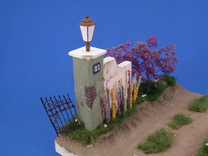
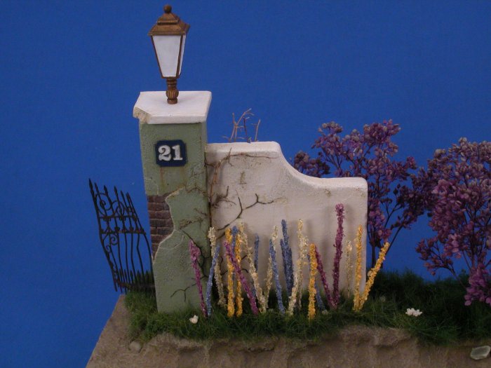
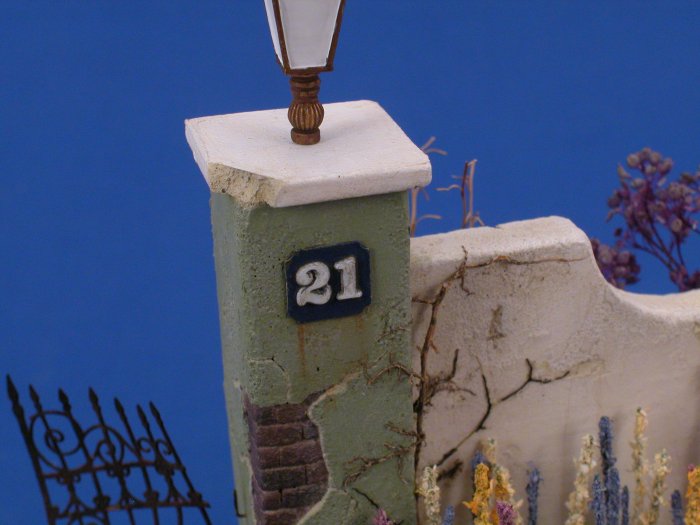
Sticky's Monroe Perdo Sunken Road (PICs)
Vermont, United States
Joined: September 14, 2004
KitMaker: 2,220 posts
Armorama: 1,707 posts
Posted: Thursday, April 20, 2006 - 02:34 AM UTC
Thanks Guys,
Quoted Text
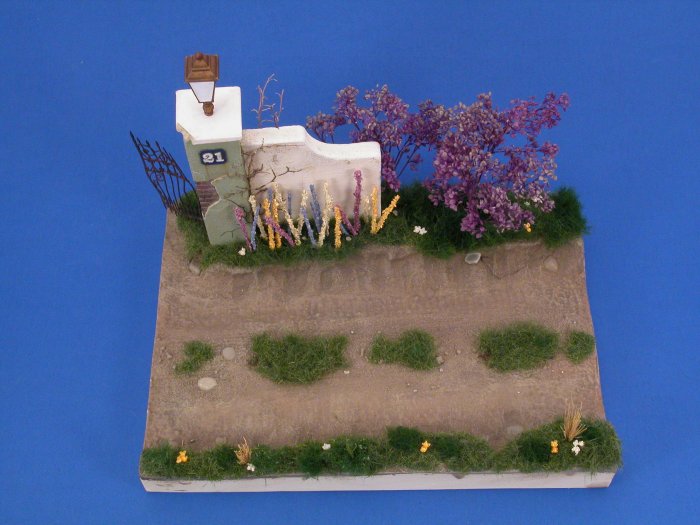
Hi John .. I really love what you're doing with the base so far ..I'm just wondering but shouldn't the fence keep going along the top with some type of wall ..the gate doesn't look too badly damaged .
Just wondering ...
Rick
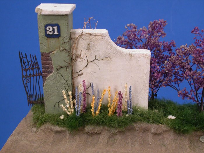
Rick, I'm not really sure what you mean. But the wall and gatepost are ornimental in nature, the gate itself will be bent up more before I am done!
Cheers
"Call on God, but row away from the rocks."
-- Hunter S. Thompson
Massachusetts, United States
Joined: June 16, 2002
KitMaker: 2,312 posts
Armorama: 1,054 posts
Posted: Thursday, April 20, 2006 - 03:42 AM UTC
John, looking really good!
Would you mind sharing with us the combination of colors and media you used when painting the ground?
Marty
"If it's not messy it's not creative"
Vermont, United States
Joined: September 14, 2004
KitMaker: 2,220 posts
Armorama: 1,707 posts
Posted: Thursday, April 20, 2006 - 07:02 AM UTC
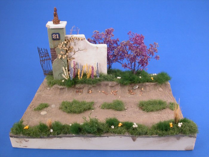
Thanks Marty. The base was painted with Delta brand acrylics from walmart.
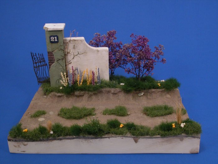
Delta Ceramcoat I used burnt umber on the raised area and mudstone on the road. They were then washed with burnt umber oil paints, with some extra heavy application in the shadow areas of the slope. Then it was drybrushed with the base colors with a little bit of Putty color mixed in. I then dusted with MMP Earth Dirt and sealed with Model Master flat Acrylic. Thats it!

"Call on God, but row away from the rocks."
-- Hunter S. Thompson
Vermont, United States
Joined: September 14, 2004
KitMaker: 2,220 posts
Armorama: 1,707 posts
Posted: Thursday, April 20, 2006 - 08:10 PM UTC
"Call on God, but row away from the rocks."
-- Hunter S. Thompson
North Carolina, United States
Joined: February 22, 2002
KitMaker: 11,718 posts
Armorama: 7,138 posts
Posted: Thursday, April 20, 2006 - 09:02 PM UTC
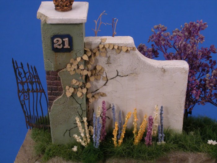
Nice - I like the flowers. Love the color - very lively, can't wait for the figures.
I would add a touch of a wash on the top cap, it's a bit clean.
Vermont, United States
Joined: September 14, 2004
KitMaker: 2,220 posts
Armorama: 1,707 posts
Posted: Friday, April 21, 2006 - 02:42 AM UTC
Thanks Scott. I think I am going to shorten the flower and vary their length a little more.
"Call on God, but row away from the rocks."
-- Hunter S. Thompson
Massachusetts, United States
Joined: June 16, 2002
KitMaker: 2,312 posts
Armorama: 1,054 posts
Posted: Friday, April 21, 2006 - 07:22 AM UTC
Thanks John for the rundown of your painting technique.
Marty
"If it's not messy it's not creative"
Vermont, United States
Joined: September 14, 2004
KitMaker: 2,220 posts
Armorama: 1,707 posts
Posted: Saturday, April 22, 2006 - 06:54 AM UTC
"Call on God, but row away from the rocks."
-- Hunter S. Thompson
North Carolina, United States
Joined: February 22, 2002
KitMaker: 11,718 posts
Armorama: 7,138 posts
Posted: Saturday, April 22, 2006 - 03:50 PM UTC
Better and better all the time.
It reminds me of jackhammer81's "The Squeeze" (sorry my Germans not that good). The colorful flowers make a really nice addition. So often you see OD or German Gray and dusty buildings that the color really makes a statement.
Vermont, United States
Joined: September 14, 2004
KitMaker: 2,220 posts
Armorama: 1,707 posts
Posted: Saturday, April 22, 2006 - 06:57 PM UTC
Cheers Scott, Thanks for the heads up on teh wall. It was the first time I tried India ink and its great, when thinned with EtOH its becomes a very thin dark brown, the perfect color for grime! I am toying with replaceing the light with some other object - a cherub, or a ball, lion, not sure yet! Ideas appreciated.

"Call on God, but row away from the rocks."
-- Hunter S. Thompson
Texas, United States
Joined: January 30, 2006
KitMaker: 1,954 posts
Armorama: 629 posts
Posted: Saturday, April 22, 2006 - 09:54 PM UTC
that is starting to look fantastic! I wasn't a fan of the tall flower stalks, but now that you cut down their height, I suddenly like them a lot. can't wait to see the figures. One minor suggestion - if you put just a few green sprigs of grass in the midlle of the dried clumps, they won't look so "placed". the other grass is so dense that it would start growing up through dead clumps, or perhaps the yellow clumps aren' dead and are just starting to sprout new blades in the center (a bit of a late starter that spring maybe?). the dead blades are likely to not ALL be standing so upright by early to mid spring either. Id recommend fanning them out a bit (esp. the ones on the outside, and make sure some of the new grass is growing over the bits that have flopped over.
I'd also put a small amount of foliage at the base of those flower stalks. those clearly aren't grass flowers, so a suggestion of some sort of small, wide leafed (or spade leafed like an iris or tulip) perrinial plant would really make that row of flowers pop - especially if done in a different shade of green (grey grren, bright green, or even with tinges of reddish or purplish color - decorative plants give you a vast array of colors to choose from for their foliage).
one last thing - the small wildflowers on both sides of the road seem to unnaturally exactly across the road from each other, and perhaps to uniformly spaced as well.
FYI, i offer these critiques/observations as a gardener, not a modeler, since that is a way better job than i can do on diorama grass!
-v-
New York, United States
Joined: December 07, 2004
KitMaker: 1,888 posts
Armorama: 315 posts
Posted: Saturday, April 22, 2006 - 10:03 PM UTC
That looks much better now John the flowers in front of the wall look more natural now that you varyed the heights, i never thought you were finished anyway, everything else looks good.
Vermont, United States
Joined: September 14, 2004
KitMaker: 2,220 posts
Armorama: 1,707 posts
Posted: Sunday, April 23, 2006 - 01:26 AM UTC
Cheers! Vance execellant advice - I am not a gardner - just a yard monkey for SWMBO! I will look for the appropriate parts ASAP!

"Call on God, but row away from the rocks."
-- Hunter S. Thompson
Vermont, United States
Joined: September 14, 2004
KitMaker: 2,220 posts
Armorama: 1,707 posts
Posted: Sunday, April 23, 2006 - 02:18 AM UTC
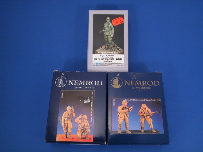
Well half the figs I ordered came in, and as promised I shot a pic of them. They are very nice. The top one is white metal the lowers resin.


"Call on God, but row away from the rocks."
-- Hunter S. Thompson
Vermont, United States
Joined: September 14, 2004
KitMaker: 2,220 posts
Armorama: 1,707 posts
Posted: Monday, May 22, 2006 - 07:50 AM UTC
"Call on God, but row away from the rocks."
-- Hunter S. Thompson
Tekirdag, Turkey / Türkçe
Joined: August 21, 2002
KitMaker: 3,289 posts
Armorama: 661 posts
Posted: Monday, May 22, 2006 - 12:38 PM UTC
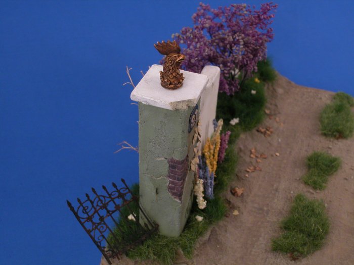
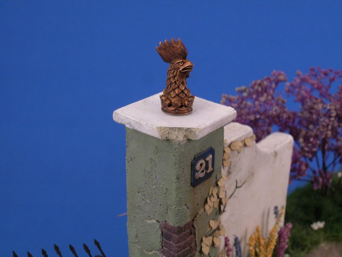
John, I don't believe myself that I missed this threat. Your work is going great as usual. ı like the foliage and plaster work. Switching out the lamp with that orniment is a nice idea, that orniment adds a nice interesting point to the scene.
Thanks for sharing

North Carolina, United States
Joined: February 22, 2002
KitMaker: 11,718 posts
Armorama: 7,138 posts
Posted: Monday, May 22, 2006 - 03:14 PM UTC
A rooster huh. He's a very mean looking rooster

I like it, it's different, fitting, shape wise composition wise - I like it.
Gdańsk, Poland
Joined: February 27, 2005
KitMaker: 247 posts
Armorama: 228 posts
Posted: Monday, May 22, 2006 - 07:21 PM UTC
Ola John
I have to say that this base is looking really great. The whole road surface is very realistic and has a good shape. Things like small rocks on the side, the grass in the middle and the leaves on the ground really make it look even better. The wall is also marvelous, the white part is not to bright yet not to dark, just perfect. The weathering is done very well, which in combination with the lilas and the broken gate creates a wonderful scene.
Ok enough sweet talk, now the things that I don't like:)
I thing that the ornament on the wall is looking worse than the lamp. Well the lamp wasn't really that great but if you would add smth which imitates glass better and maybe break one of the glass sides to show the inner of lamp (bulb), that would make it more realistic. I'm also not to crazy about those colorful sticks in the front of the wall. What exactly are they imitating? I would switch it to something less sticklike, maybe a small bush.
I salute you my friend, for creating such a wonderful base:)
Take care and happy modeling,
dsc.
Vermont, United States
Joined: September 14, 2004
KitMaker: 2,220 posts
Armorama: 1,707 posts
Posted: Monday, May 22, 2006 - 07:57 PM UTC
Thanks guys, Feed back appreciated. The stalks are Lupins. I'm not sure they are present in Europe, but they are very prevalent here. I am still working on the wall ornament. I have designed this decal for the wall, does this tie it together better?

"Call on God, but row away from the rocks."
-- Hunter S. Thompson
Sri Lanka
Joined: May 05, 2005
KitMaker: 2,174 posts
Armorama: 582 posts
Posted: Tuesday, May 23, 2006 - 12:53 AM UTC
Awesome work, John. One thing: I find the grass in the road a stark contrast to the dirt, particularly coz the grass is in clumps. How about placing some individual stalks of grass in the dirt to connect the clumps. And/or dust up the grass a bit with road dirt. I think that might blend things a bit.
Did you add pebbles and sand to the original base or did it come moulded on?
Vermont, United States
Joined: September 14, 2004
KitMaker: 2,220 posts
Armorama: 1,707 posts
Posted: Tuesday, May 23, 2006 - 01:03 AM UTC
Hi David, thanks for the feedback. The sand and rocks etc are part of the casting for the base. I will be blending all the elements when it is closer to finish, but I agree maybe some smaller clumbs of grass in the blank areas would look better.

"Call on God, but row away from the rocks."
-- Hunter S. Thompson
Nebraska, United States
Joined: August 12, 2003
KitMaker: 2,394 posts
Armorama: 1,695 posts
Posted: Wednesday, May 24, 2006 - 06:54 PM UTC
Hi John, sorry I missed this thread but at least I am here now :-)

I love the use of the rooster on the column, he at first made me skepitcal but I think he fits quite nice now with the addition of the wall plaque you have designed. Earlier you had mentioned using india inks for the first time(great stuff they are!) and that you thinned them with "EtOH" well my question is what this is? I have always just used alcohol or water to thin them when I used them and this intrigues me. The whole base is looking great, cant wait to see it with the figures on it. How are they coming? Cheers Kevin
Kansas, United States
Joined: April 11, 2005
KitMaker: 417 posts
Armorama: 118 posts
Posted: Friday, May 26, 2006 - 01:56 AM UTC
John
I really like the direction this going. I agree with just about all of the suggestions so far.
My comment: The Rooster...IMO he should be of stone to match the square column top that he's sitting on. I think as he stands now(coloring) he stands out too much like the lamp did. He definitely has more character though.
You're going to have a winner!
Best regards,
Gary

The road goes on forever and the party never ends!
Better to have and not need than need and not have!
IPMS # 6640
Alberta, Canada
Joined: January 19, 2005
KitMaker: 4,085 posts
Armorama: 3,917 posts
Posted: Friday, May 26, 2006 - 08:53 AM UTC
Very nicely done. It'll look great when it's finished.
Nice photography too.
FYI....it's Monroe Perdu not Monroe Perdo.
"We're not the public service of Canada, we're not just another department. We are the Canadian Forces, and our job is to be able to kill people."
July 2005- General R.J. Hillier (Retired), Former Chief of the Defence Staff
Vermont, United States
Joined: September 14, 2004
KitMaker: 2,220 posts
Armorama: 1,707 posts
Posted: Monday, May 29, 2006 - 10:34 PM UTC
Thanks for the feedback guys. Much appreciated. I have been busy reworking figs, when I have some significant progress I will post up pics!

"Call on God, but row away from the rocks."
-- Hunter S. Thompson


